We Audited 50 AI Features. 9 Out of 10 Made the Same UX Mistake.
.avif)
.avif)
In this article, you will learn the 10 most common UX failures in AI product features — and why fixing them is design work, not a model problem.
Look at almost any product launched in 2025 or 2026. Buried somewhere in the UI, usually behind a sparkles icon, there's an AI feature. Sometimes it's a chat box. Sometimes it's an "AI suggestions" panel. Sometimes it's a button labeled "✨ Generate" that nobody at the company can quite explain.
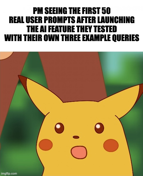
The feature got built. The launch post went out. The press release used the word "intelligent" four times. And then, three weeks later, the dashboards came in: usage is low, completion rates are bad, support tickets are up, and the product team is quietly wondering whether the whole thing was worth it.
It probably was. The AI feature isn't the problem. The UX of the AI feature is the problem.
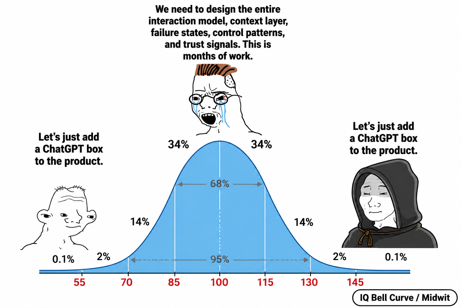
Here's the uncomfortable truth: shipping an AI feature is not 10x easier than shipping any other feature. The model does part of the work. UX has to do the rest. Most teams skipped the UX part entirely — the demo looked impressive in a controlled environment, and they assumed users would figure out the rest.
Users don't figure it out. Here are the ten things almost every AI feature gets wrong.
1. There's no userflow — just a chat box and hope
Before you ship an AI feature, you should be able to draw the flow. Where does the user enter it? What's the most likely first thing they'll do? What does the second turn look like? The fifth? How does the user know when they're done? How do they leave with something they can use elsewhere in the product?
Most teams can't answer any of these questions. The "design" was: drop a chat box on the page, point it at an LLM, ship. There's no defined success state. There's no defined failure path. The user wandered in, asked something vague, got an answer, didn't know what to do with it, and left. That isn't a feature. That's an exit ramp with a sparkles icon.
A real AI feature has a userflow as carefully designed as a checkout funnel. Entry points. Expected paths. Branching for different intents. A clear "I got what I came for" moment. Without these, you've shipped a science fair demo with a billing system attached.
2. The AI has no idea where the user is or what they're doing
This one is so common it should be a meme. The user opens a chat assistant inside your product. They're three clicks deep into a specific project, looking at a specific dashboard, asking about a specific row of data. They type: "why is this number weird?"
The AI has no idea what "this" refers to. It can't see the page. It can't see the user's account. It doesn't know which project they're in, which view is open, what they were looking at thirty seconds ago, or what they asked the AI yesterday. So it either asks a clarifying question (annoying) or hallucinates a generic answer (worse).
Context isn't optional. The AI feature should know, at minimum: which page the user is on, which entity they're viewing, the recent action history, and — if the user has chatted before — what previous conversations covered. If your AI assistant in 2026 still opens with "what would you like help with today?" when the user just clicked a specific item, your context layer is missing.
The work here is mostly invisible: deciding what context to pass to the model, how to summarize past conversations without bloating the prompt, when to refresh state, how to scope by permissions. Boring engineering and design work. Everyone wants to skip it. Skipping it produces an assistant that feels like talking to someone who's never met you and has the memory of a goldfish.
3. Nobody can find your AI feature
A great AI feature that nobody discovers is a budget line item, not a product. Most teams hide the AI behind a small sparkles icon in the corner, mention it once in the changelog, and expect organic adoption. Then they wonder why usage is at 4%.
Discoverability for AI features is harder than for regular features, because users don't have a mental model of what AI can do for this product specifically. They've used ChatGPT. They don't know what your version can or can't do, or why they should care.
The fix isn't louder onboarding popups. The fix is contextual surfacing: the AI appears where it's likely to be useful, when it's likely to be useful, with a clear suggestion of what to ask. "Stuck on this report? Ask AI to summarize it.""Want to draft a reply to this email? Try AI." Surface the AI at the moment of need, with a concrete first prompt, not as a generic chat box waiting for nobody.
4. The blank input is a UX disaster
When a user opens your chat assistant for the first time, they see a blinking cursor in an empty input field. Their brain has to do three things at once: figure out what this thing can do, decide what they want from it, and translate that desire into a prompt. Most users abandon at step one.
This is the blank input problem, and it kills first-time activation in AI features more than any other single issue. The fix is dead simple, and almost nobody does it well: visible suggested prompts, organized by user intent, refreshed based on context.
Not generic suggestions like "Tell me a joke" or "Help me brainstorm." Specific, contextual, click-to-send prompts that match what users actually want to do in your product. "Summarize this thread." "Draft a follow-up to the customer above." "Compare these two analytics periods." The user clicks one, sees a useful result, and now they understand what the AI is for. That's the activation moment. Without it, they bounce — and rarely come back.
5. There are no trust signals
When the AI gives an answer, can the user tell where it came from? Is it pulled from their own data, or invented? Did it cite a source? Is the confidence level visible? Is there a way to verify what the AI just told them?
In 2026, users are rightly suspicious of AI output. They've been burned. Your AI feature, no matter how good its underlying model, needs to communicate trust signals constantly: "Based on your last 5 invoices." "Source: project documentation, March 2026." "Drafted from your past replies." "This is a general response — not specific to your account."
The teams that skip this are the same teams whose users stop using the AI feature within two weeks. Not because the AI was wrong — because users couldn't tell when it was right and when it wasn't. Distrust is fatal. Trust is built one cited source at a time.

6. There's no graceful "I don't know"
Ask most product AIs a question they shouldn't try to answer — something outside their domain, something about data they don't have access to, something legally sensitive — and watch what happens. Most of the time, they make something up. Confidently. With perfect grammar.
This is a UX failure, not a model failure. The model didn't know. It should have said so. The system around the model should have caught the gap and routed gracefully: a "let me connect you with support" handoff, a "this is outside what I can help with" message, a "I don't have enough information about your account to answer that — try X instead" response.
Designing graceful failure is harder than designing success. It requires deciding, in advance, what categories of question the AI shouldn't try to answer at all, and what the fallback experience looks like for each. The teams that skip this ship products where the AI confidently misleads users, generates support tickets, and erodes trust on every wrong answer. The teams that do it well ship products where users trust the AI more — because they've seen it admit ignorance and route them somewhere useful.
7. The user has no control over the output
The AI generated something. Now what? Can the user edit it inline? Regenerate with different parameters? Accept some parts and reject others? See alternatives? Undo? Roll back to a previous version? Tell the AI "shorter" or "more formal" without retyping the entire prompt?
In most product AI features, the answer is: "type a new prompt." Which is a terrible UX, because the user now has to formulate "what was wrong with what you just gave me" in natural language, when really they wanted a button that said "Make it shorter."
User control over AI output is the single most underdesigned area in AI features today. The patterns are well known: regenerate, refine, edit-inline, version history, accept/reject for multi-suggestion outputs, side-by-side compare. Almost no product implements more than one of these. As a result, users get a result they don't quite want, can't easily fix it, and stop using the feature.
A good AI feature treats every output as a draft, not an answer. The user is the editor, not the supplicant. Design for that, and adoption goes up.
8. Loading and streaming states are an afterthought
AI is slow. Even fast AI is slow compared to native UI actions. A button click is 50ms. An AI response is 2–10 seconds. That gap is a UX surface, and most teams ignore it entirely.
What does the user see during those 2–10 seconds? A spinning circle? A pulsing dot? Nothing? Can they cancel the request if they realize they made a mistake? Can they edit the prompt while it's running? Does the response stream in token-by-token, or does it appear all at once after a long wait?
These choices are not minor. Streaming responses feel dramatically faster than batched ones, even at the same total latency. A skeleton outline of the response shape feels faster than a spinner. A "thinking..." status with substeps ("searching your data... summarizing...") feels faster than silence. Users will tolerate 8 seconds of streaming output. They will not tolerate 8 seconds of nothing.
The team that designs the in-between states wins on perceived performance by 30–50%. The team that ships a spinner loses users every time the model takes longer than expected.
9. Multi-step actions ship with no preview or rollback
This is the specific 2026 problem. AI features are increasingly doing things, not just answering questions. Draft an email and send it. Reorganize a folder. Apply changes across a spreadsheet. Schedule a meeting. Execute a database query. Make 17 API calls and report back.
Most of these features ship with a single "Run" button and a wall of generated output after the fact. The user can't see what the AI is about to do before it does it. They can't approve step by step. They can't roll back if something went wrong. The undo is "manually reverse every change the AI made" — the UX equivalent of "good luck."
Agentic AI features need a fundamentally different UX from chat: previews of planned actions, step-by-step approval modes, rollback after execution, and full audit logs of what was done and why. Without these, users either avoid the feature entirely (because the risk of damage is too high) or use it once, regret it, and never use it again. Either way, you spent a quarter building a feature with negative ROI.
10. Your AI helper is, on net, making things worse
Here's the meta-rule that ties all nine of the above together: if your AI feature isn't making the product clearly better, it's making it worse. There is no neutral position. An AI feature that occasionally helps and frequently confuses is a net negative — even if the helpful interactions look impressive in your launch deck.
The damage compounds. Users who get burned once by a wrong answer get cautious. Users who get burned twice stop trusting any AI output, including the right ones. Users who get burned three times start associating your brand with low-quality AI, which leaks into how they perceive the rest of the product. The AI feature you shipped to differentiate your product is now differentiating it in the wrong direction.
The teams that get this right are ruthless about scope. They build AI features that do one thing well, in one clearly defined context, with one clear value proposition, and with all of the UX scaffolding above. They don't ship "AI everywhere." They ship "AI here, specifically, for this." And they kill features that don't move the metric, even when leadership wants to keep them for the next press release.
In conclusion — a note for CMOs and Product Managers
If your product has an AI feature and you're not sure how it's performing, run this audit before your next planning cycle:
- What's the activation rate on the AI feature? (First-time → second-time use.)
- Of users who tried it once, what percentage came back within seven days?
- Are support tickets up since you launched it?
- Can your team articulate, in one sentence, what the AI feature does that nothing else in the product does?
If activation is under 30%, retention is under 20%, support is up, or your team can't answer question 4 — you have an AI feature with a UX problem, not a model problem.
The good news: this is fixable in a sprint or two for most products. The bad news: nobody on your engineering team is going to fix it on their own, because the work isn't engineering. It's userflow design, context architecture, prompt UX, failure-state design, trust-signal patterns, and control surfaces. All the things teams skipped because the demo looked good.
The AI didn't fail your users. The UX around the AI did.
Work with ANODA
We're a UI/UX design and development agency for SaaS, Fintech, and AI products. Since 2013, we've helped companies turn complicated products into interfaces real users adopt and keep using. For the last three years, that work has increasingly meant designing the UX around AI features — the userflows, context layers, trust signals, failure states, and control patterns that determine whether an AI feature gets used or quietly buried.
We use AI heavily in our process. We also know exactly where it breaks — because we've designed around those breaks dozens of times.

— The ANODA team UI/UX Design & Development · Designing AI features users actually adopt, since 2013

Got Questions?
Because the model does part of the work, and UX has to do the rest. Most teams skip the UX part entirely — the demo looked impressive in a controlled environment, and they assumed users would figure out the rest. They don't.
There's no defined entry point, no expected path, no success state, no failure path, no "I got what I came for" moment. The user wandered in, got an answer they didn't know what to do with, and left. That's a science fair demo with a billing system attached.
Without it, the AI can't understand what the user is looking at, which entity they're working with, or what they asked before. An assistant that opens with "what would you like help with today?" when the user just clicked a specific item has no context layer.
When users open a chat assistant and see an empty field, their brain has to figure out what the tool can do, decide what they want, and translate it into a prompt — all at once. Most abandon at step one. Contextual suggested prompts solve this.
Source citations ("based on your last 5 invoices"), scope markers ("this is a general response — not specific to your account"), and data provenance ("drafted from your past replies"). Without these, users can't tell when the AI is right versus when it's guessing.
With a graceful failure — a clear "this is outside what I can help with" message, a handoff to support, or a suggestion of where to go instead. Designing failure states in advance requires deciding which question categories the AI shouldn't attempt at all.
At minimum: regenerate, refine (shorter/more formal), edit inline, and undo. Most products offer only "type a new prompt," which forces the user to articulate what was wrong in natural language when a button would do it in one click.
Streaming responses feel dramatically faster even at the same total time. A skeleton outline, substep status ("searching your data… summarizing…"), or token-by-token reveal makes 8 seconds tolerable. A spinner for 8 seconds loses users every time.
Previews of planned actions before execution, step-by-step approval mode, rollback after execution, and full audit logs. Without these, users either avoid the feature entirely or use it once, regret the damage it caused, and never return.
Check four metrics: activation rate (first to second use), 7-day retention among users who tried it once, support ticket volume since launch, and whether your team can explain in one sentence what the AI feature does that nothing else in the product does. Under 30% activation or under 20% retention points to UX, not the model.
.png)


.avif)


.avif)


.svg)
.svg)

