Glimix

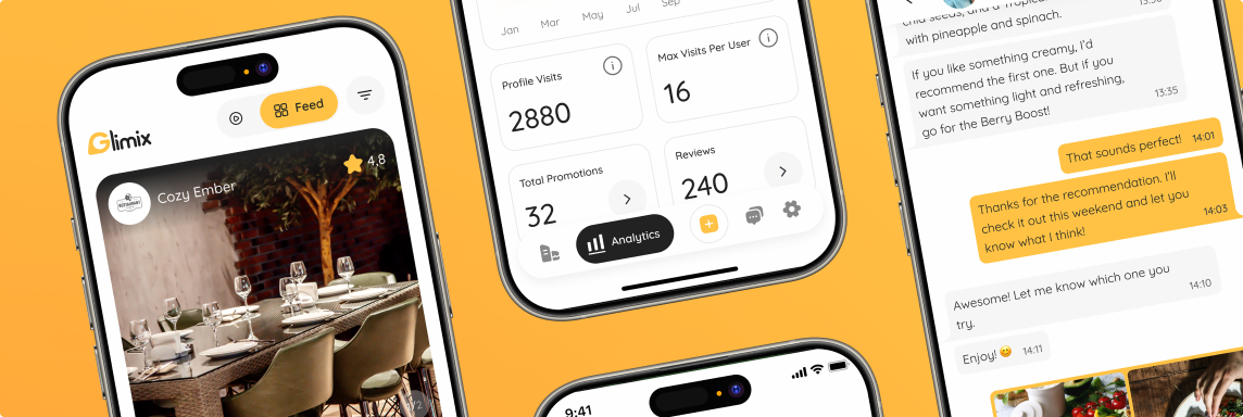
Final results


Project overview


The Glimix team approached us to redesign their platform ahead of the beta launch.
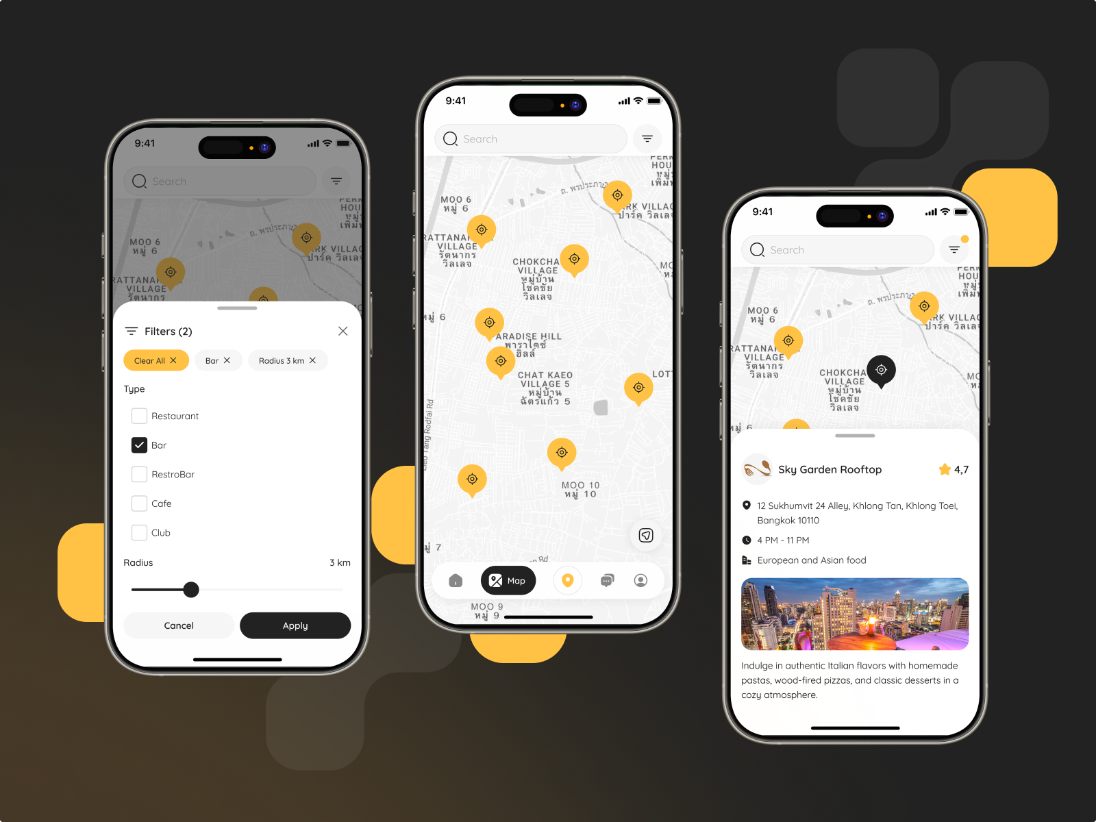
The product connects businesses with users who post reviews of local spots — combining credibility with community. Our task was to create a clean, modern interface without dark mode, focusing on clarity and ease of use.

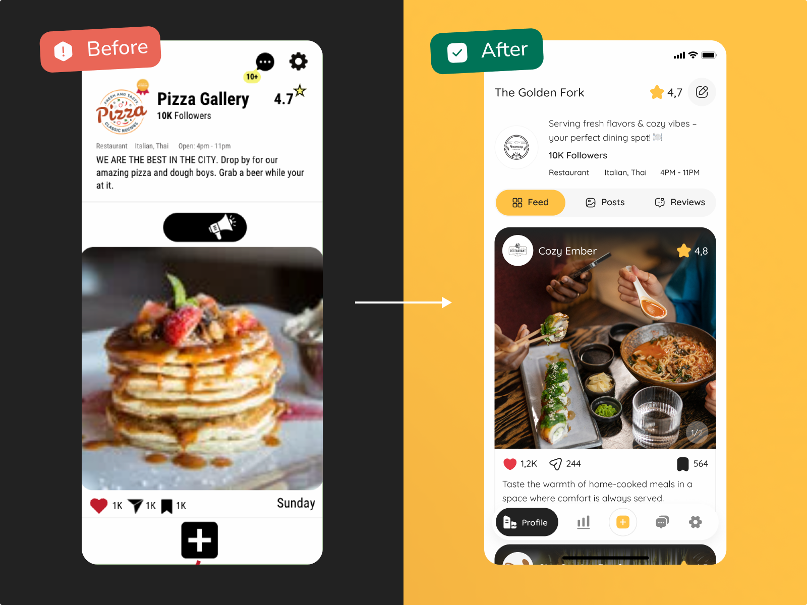
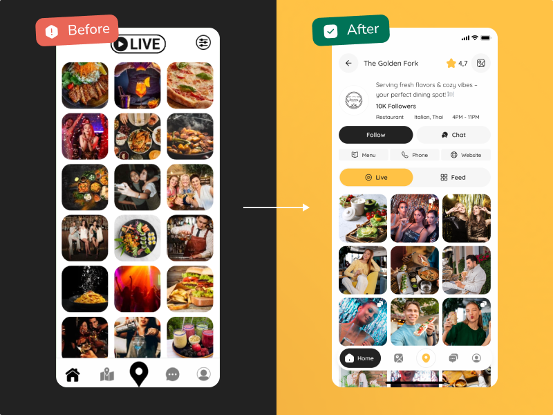
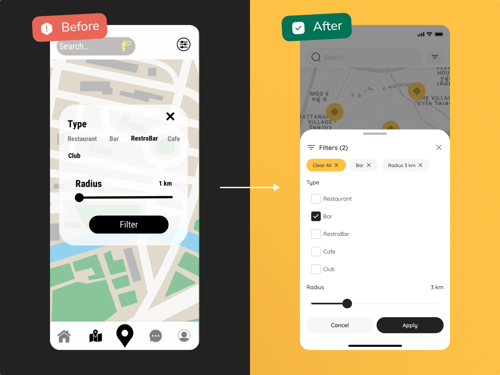
Our challenge here was to rethink and refine the existing design by analyzing pain points of the market and improving overall usability.
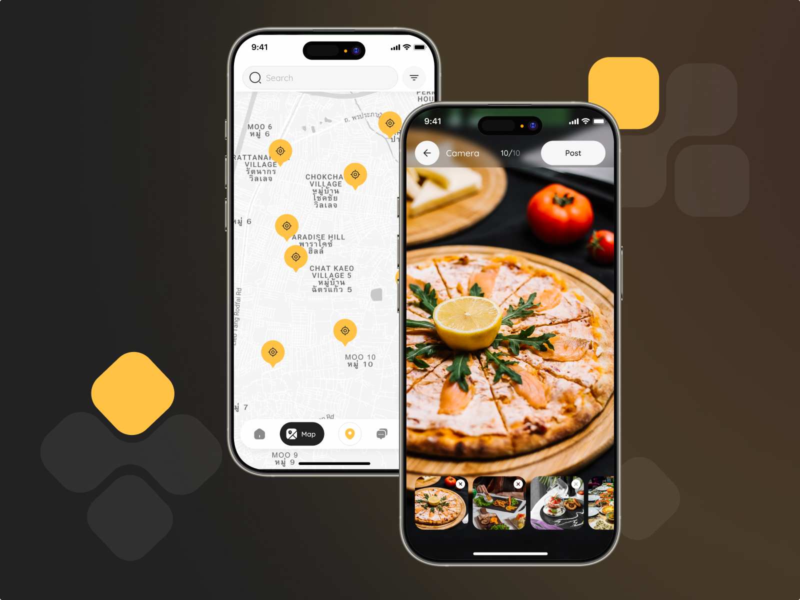
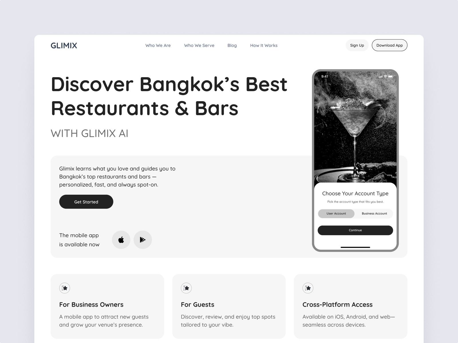
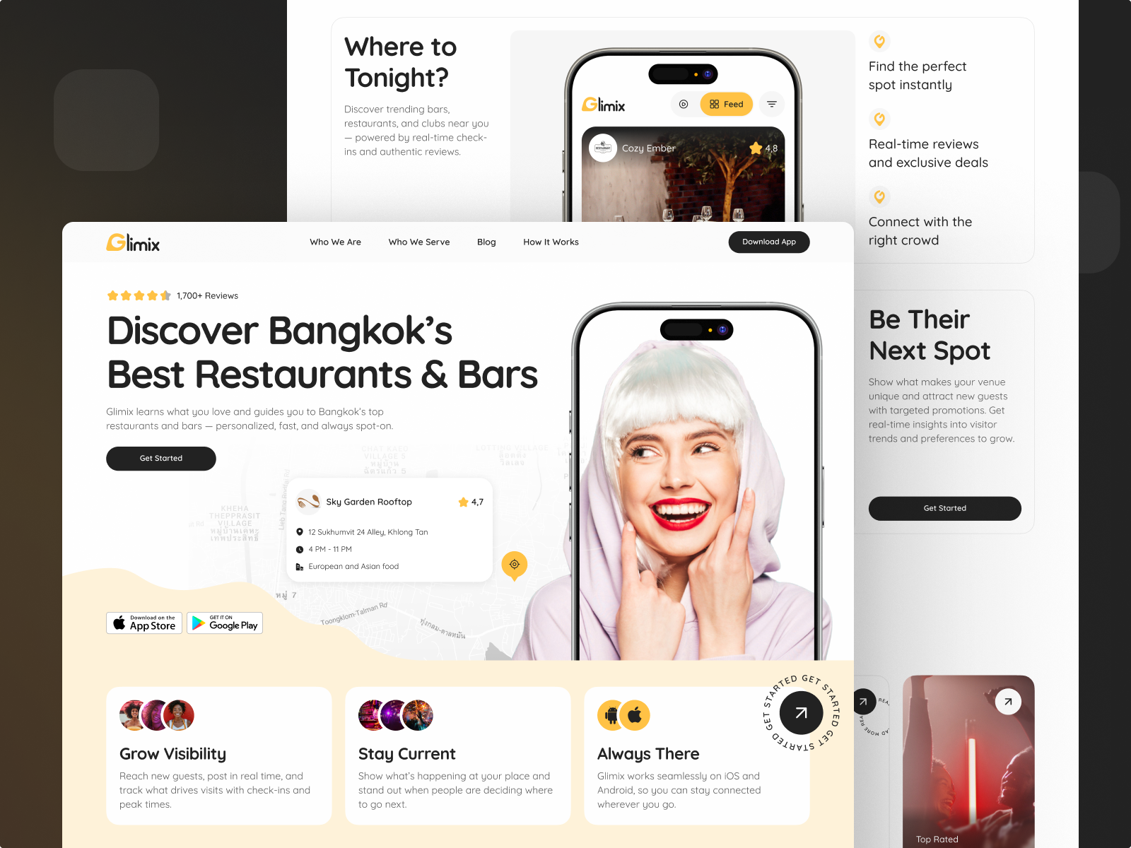
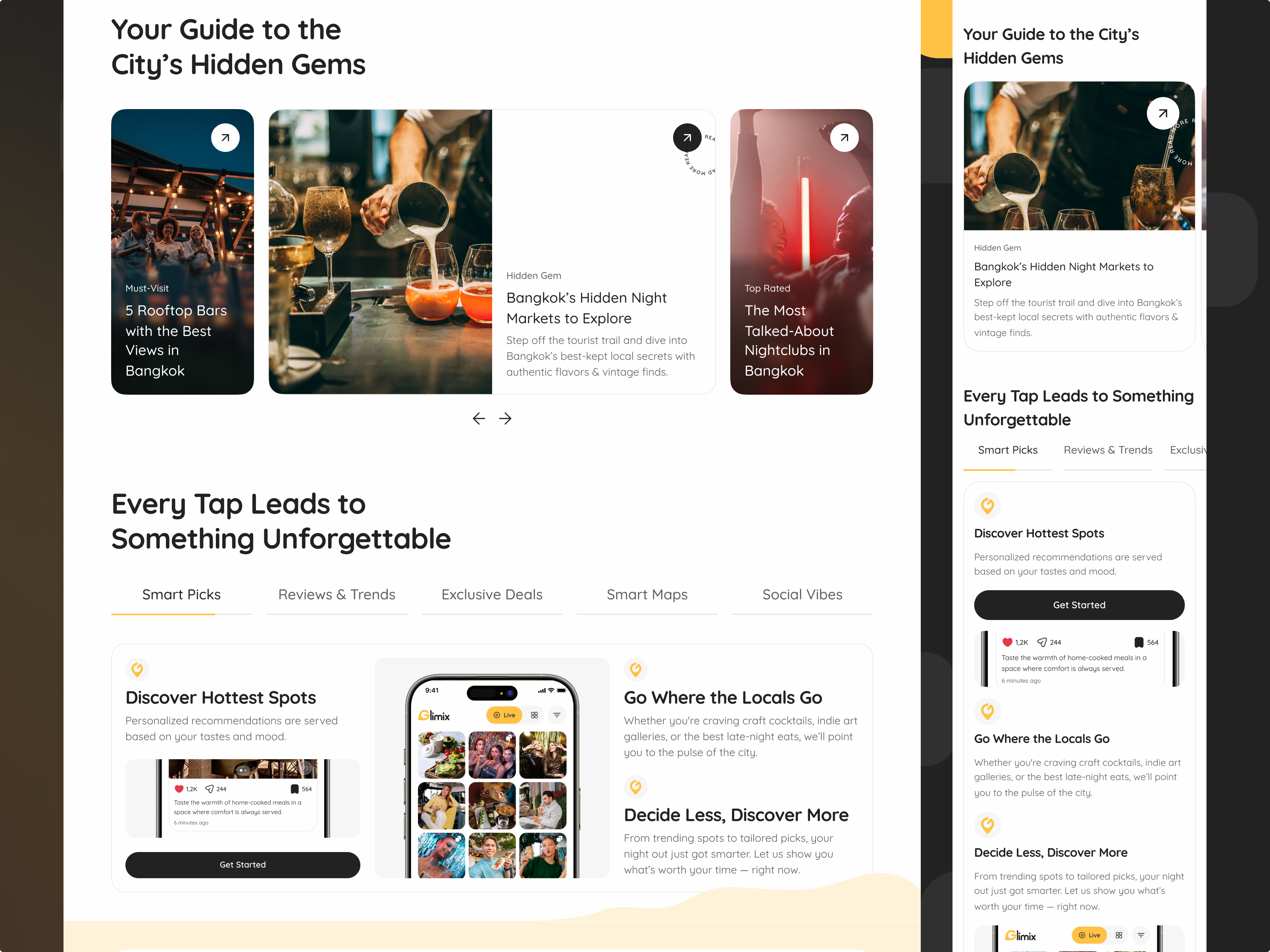
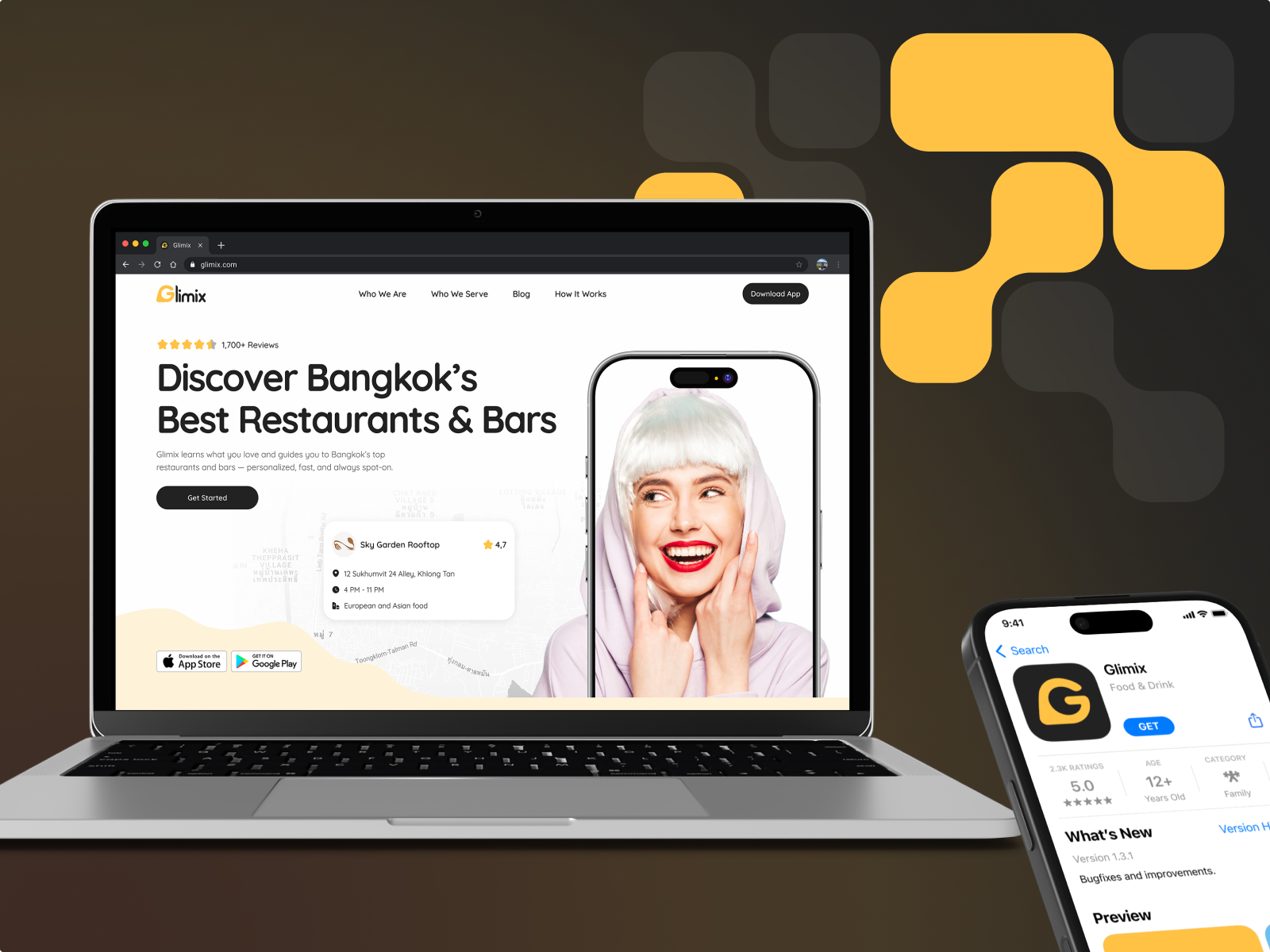
We had to create a fresh visual identity and prepare the product for market launch — a mobile app for two user roles, a bold new logo&branding, and a clean, conversion-driven landing page

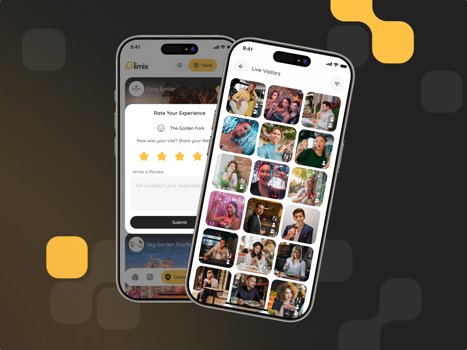
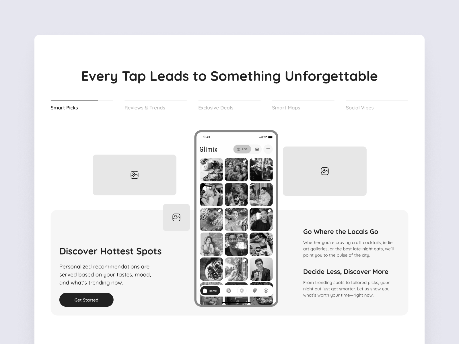
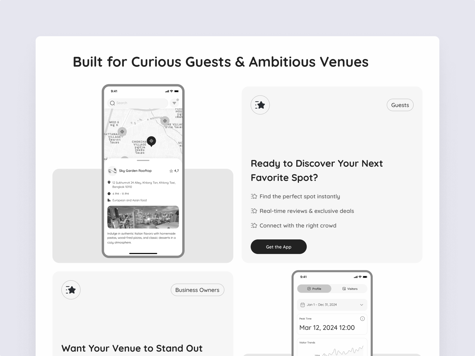
Glimix successfully launched as a vibrant mobile application, delivering on its mission to redefine social discovery. We crafted a platform where authentic user reviews and visual stories help people make smarter choices and connect with local spots in meaningful ways.
The product is fully prepared for market entry — complete with a polished landing page and strong branding
Scope of work


Architecture


Discovery
How we started: Our journey with Glimix began with in-depth research into the nightlife and hospitality space.
We analyzed user behavior and market gaps, uncovering a need for more personalized, inspiring ways to discover local spots.
This insight shaped our vision: to build a platform that helps users find places and experiences that truly resonate with their lifestyle.
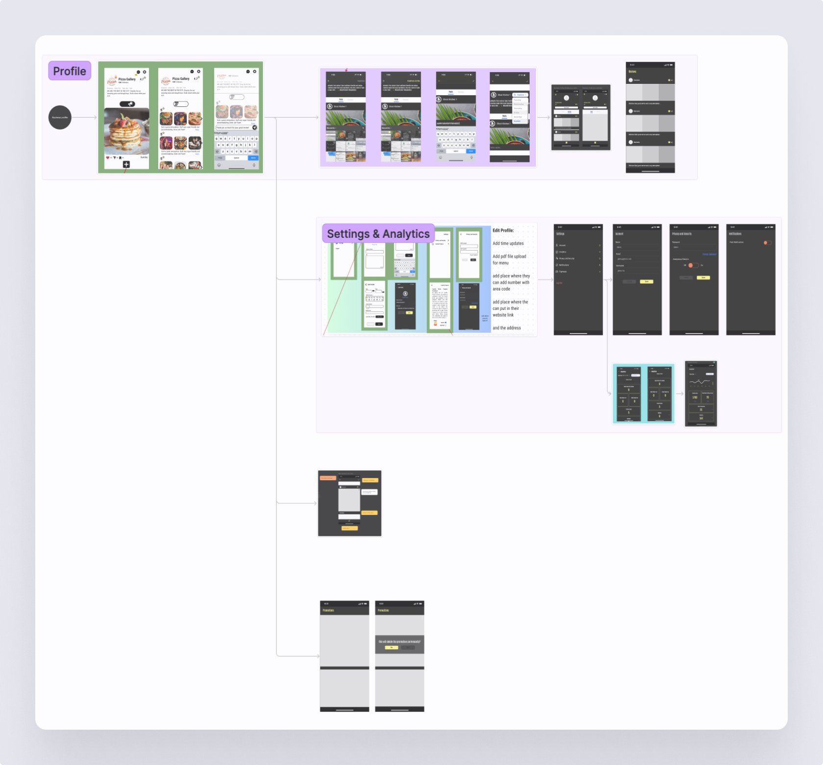
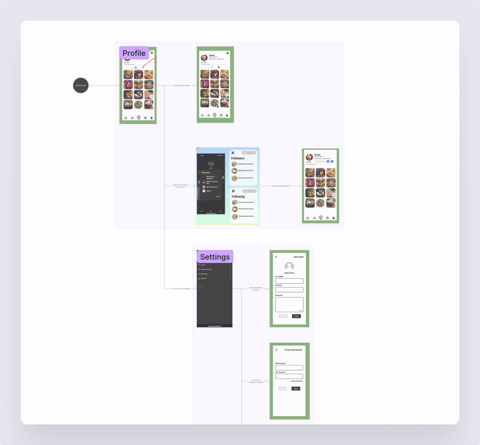
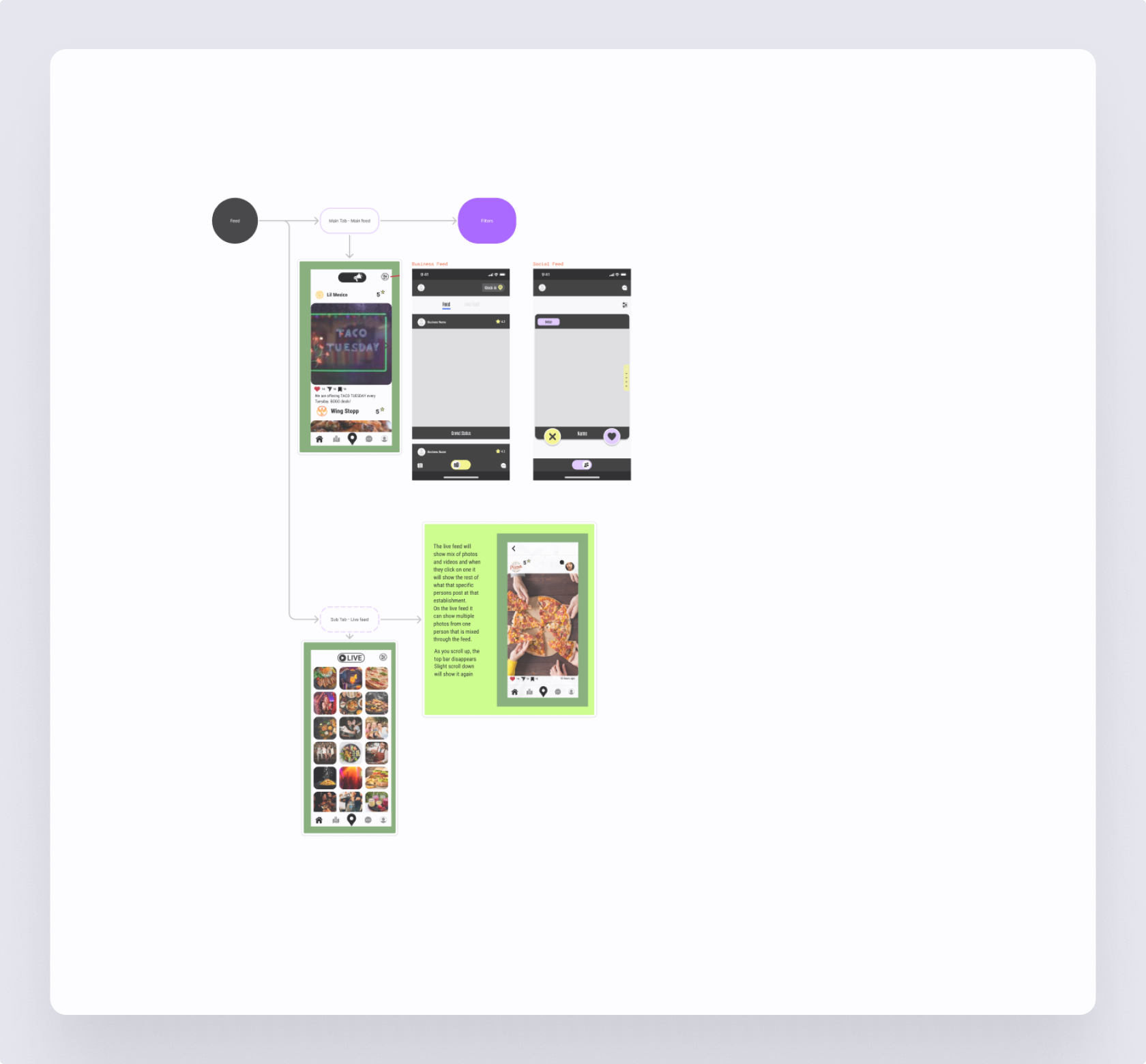
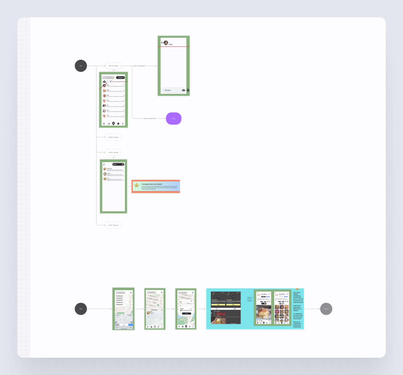
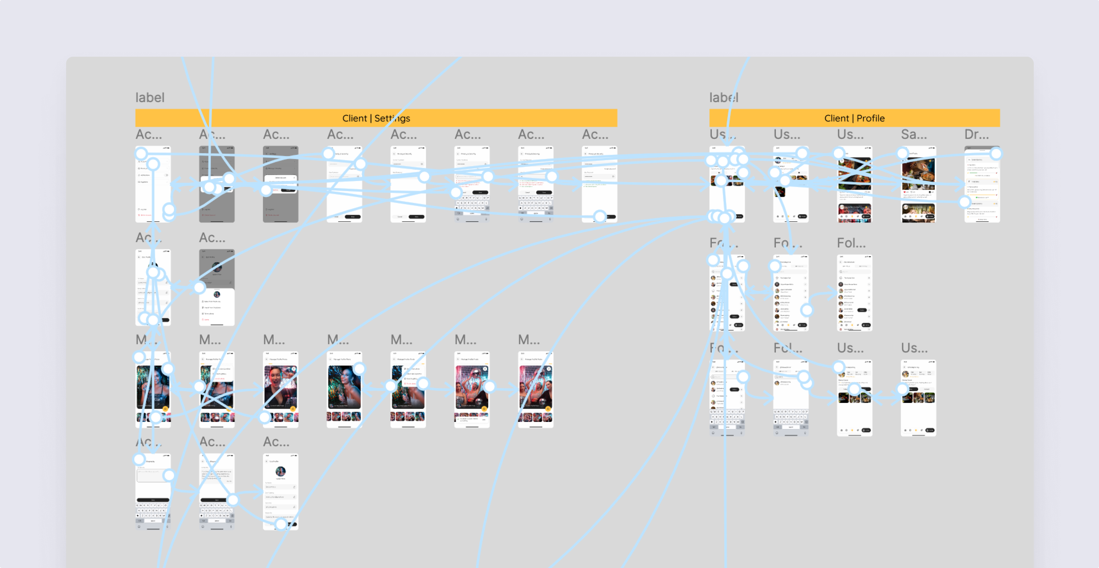
Information Architecture
Our Information Architecture for Glimix began by analyzing existing client screen layouts.
We then strategically integrated new elements and reorganized content to create a logical, intuitive, and highly discoverable mobile experience.
The goal was a seamless and optimized user journey from the very first tap.
Discover how thoughtful, user-centered design can transform your product experience and drive real business results. Learn what’s possible when design meets strategy.
Wireframes
UI prototype
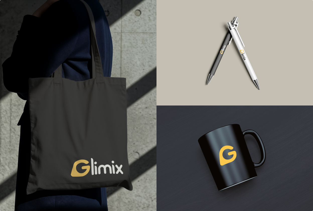
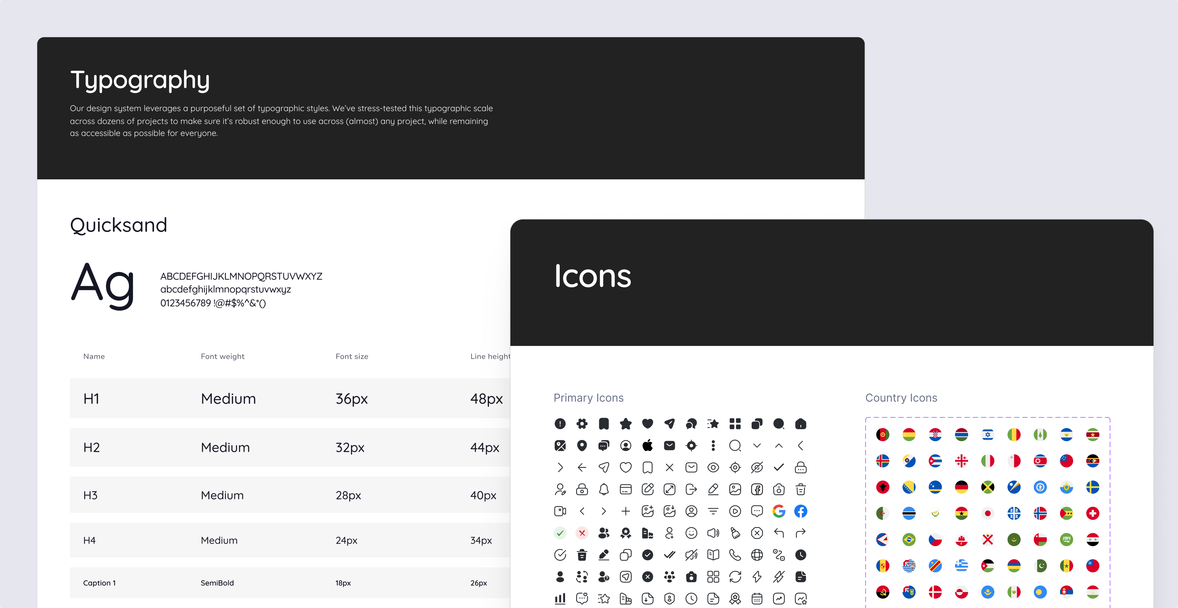
Branding & logo
We developed a distinct visual and verbal identity that radiates energy, movement, and connection, designed to be confident yet approachable. The aim was to create a magnetic vibe that speaks directly to the user's desire for genuine experiences and spontaneous discoveries.
.png)
The Glimix logo was designed to be the visual embodiment of the brand's bold, energetic, and magnetic personality. It serves as an instant identifier, reflecting discovery, connection, and the vibrant spirit of nightlife in a modern, memorable mark.
Moodboards + 3 styles

UI & design system stage

.png)

Will definitely be hiring again for future work and would highly recommend!

See It in Action: 2 UI Screens Redesigned for Free
Not convinced yet?Get 2 of your screens redesigned for free—and see the difference for yourself.
BOOK A CALLLanding page
Animations

Delivery
Development


.png)


.avif)


.svg)
.svg)
