Forever Beauty App
Final results


Project overview


Forever Beauty came to us with an existing design and an early user base. The goal was to refresh the UI to improve navigation and encourage users to stay longer within the system.
The redesign had to respect the brand’s visual identity and work seamlessly with the current backend logic — no changes under the hood, just a smarter, more engaging experience.

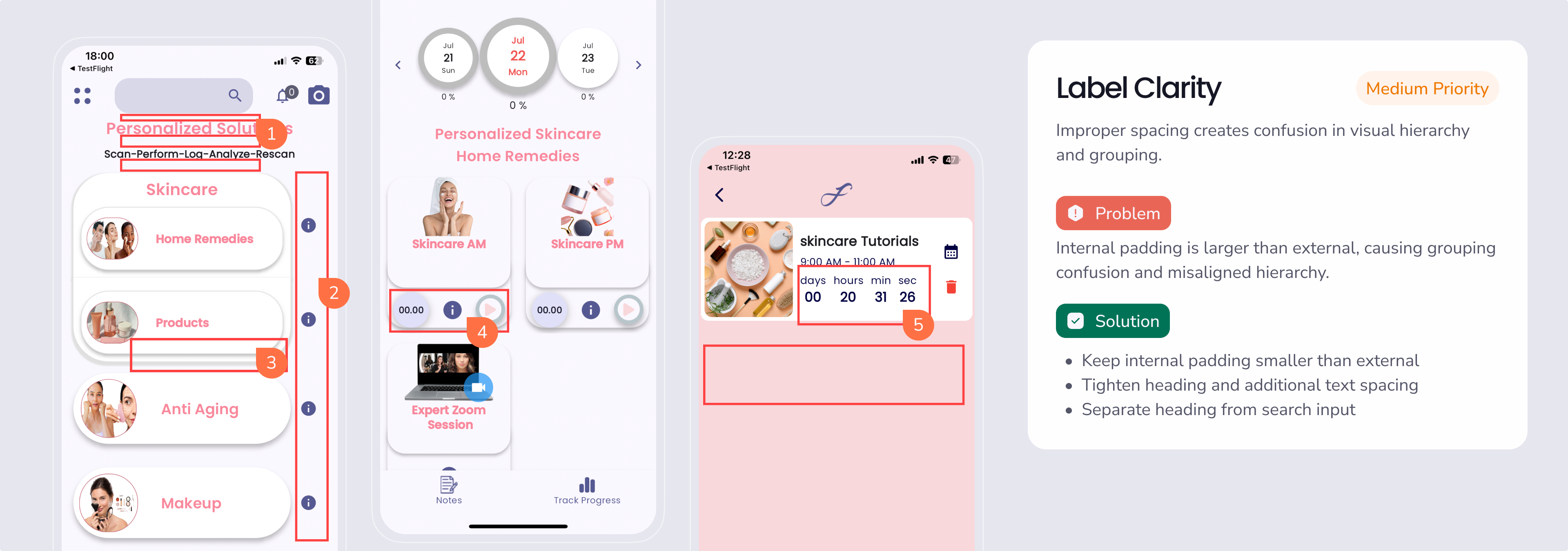
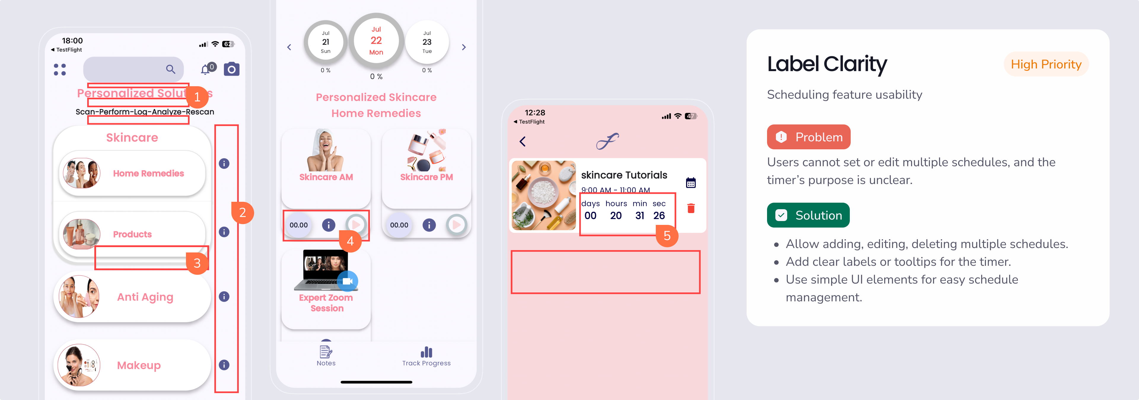
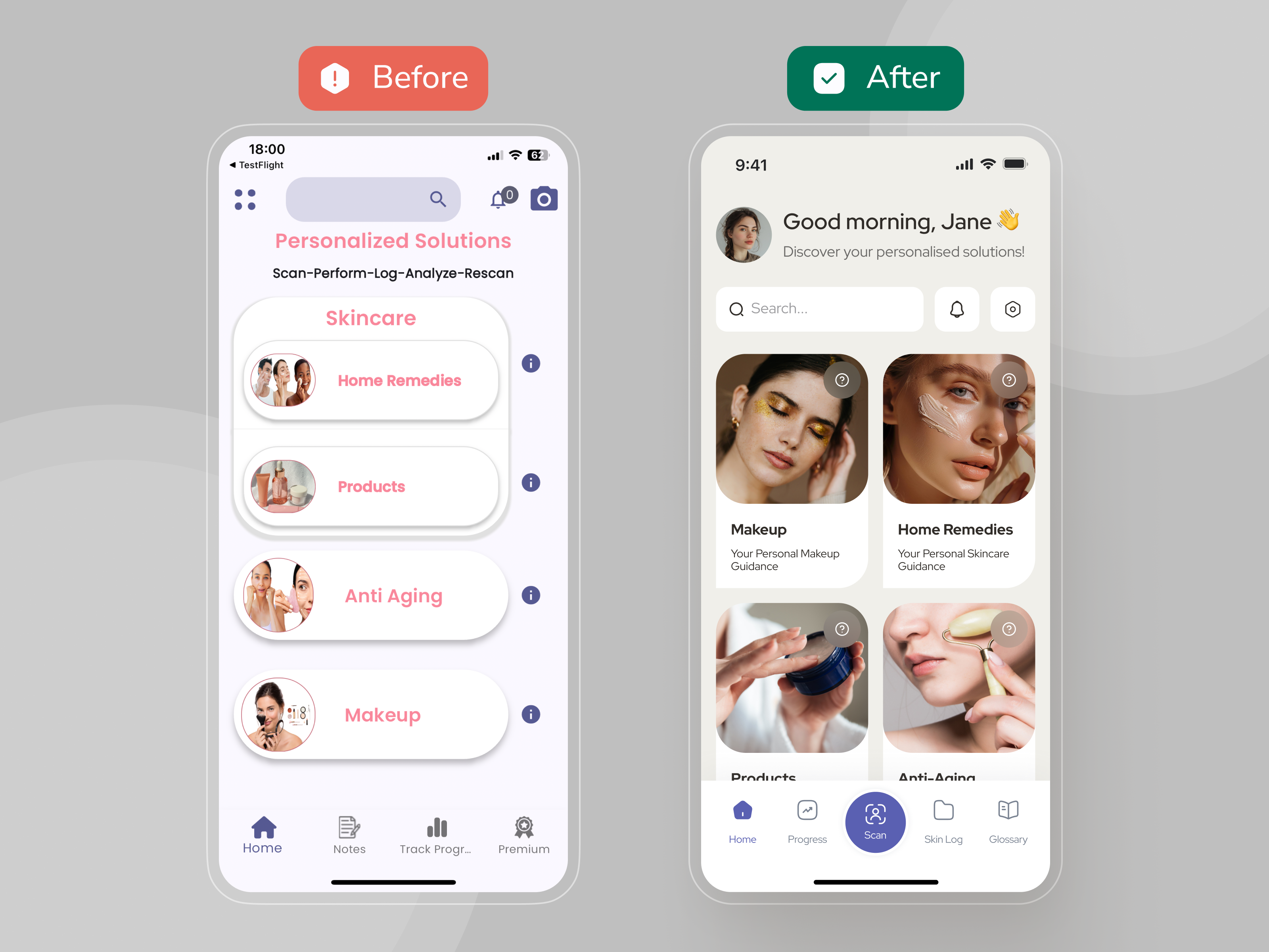
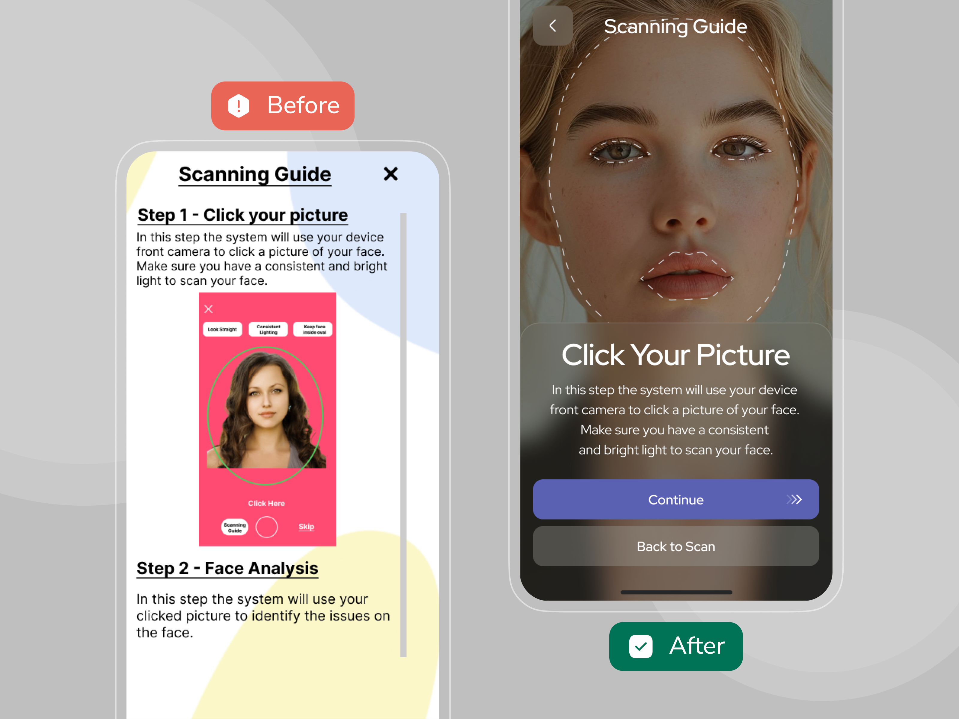
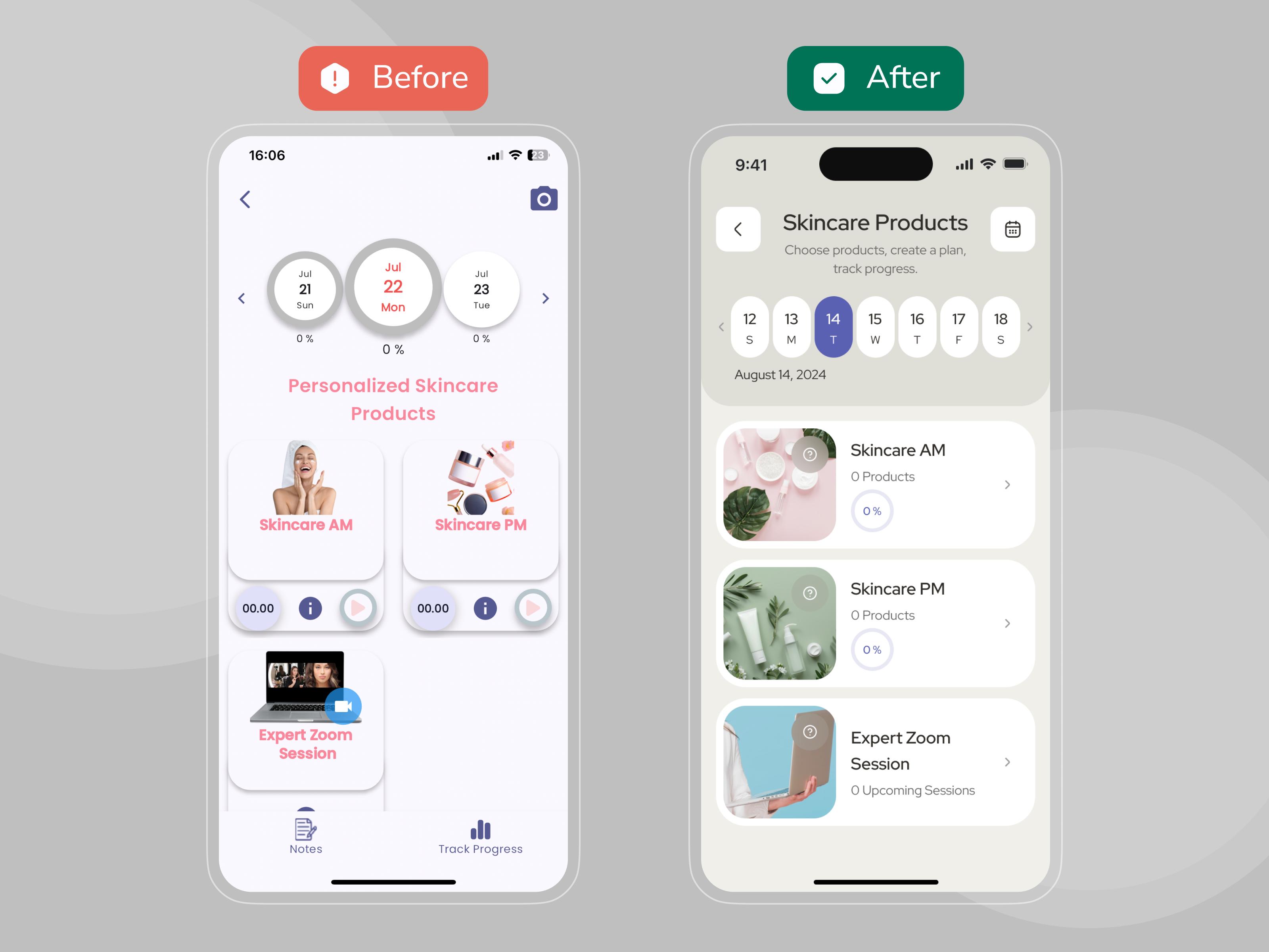
We had to solve key UX issues without changing the backend. Users struggled with navigation, lack of guidance, and overall usability.
This caused low retention and high drop-off rates — many users left before completing key actions. Our goal was to improve clarity and engagement within the existing system constraints.

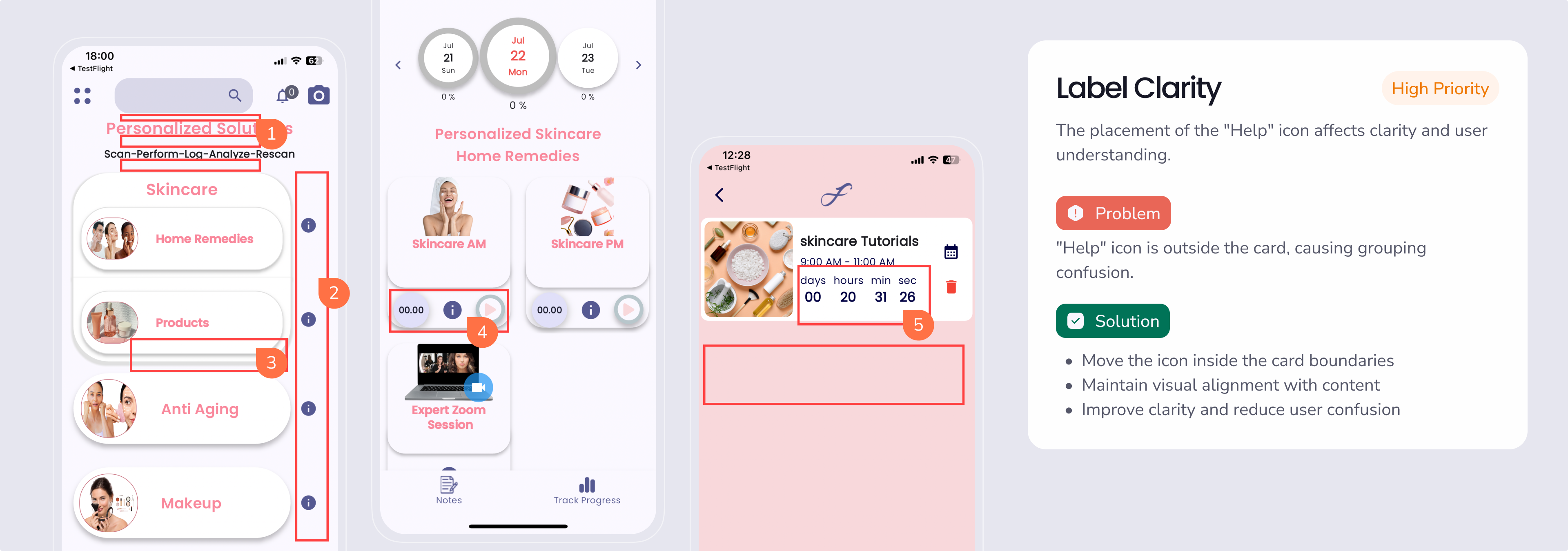
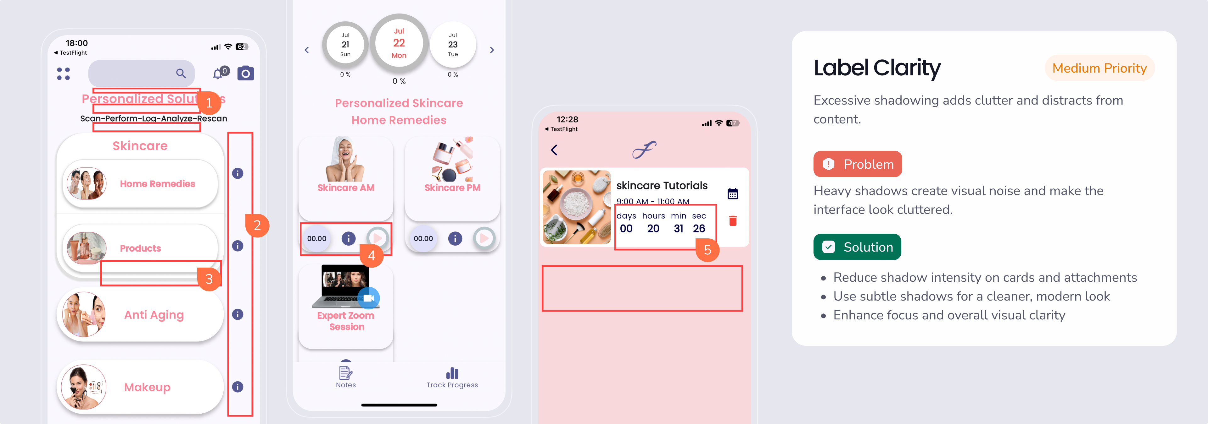
We started with a full audit of the existing screens and, guided by domain research and UX best practices, proposed a new user experience that solved key issues around unclear navigation and user confusion.
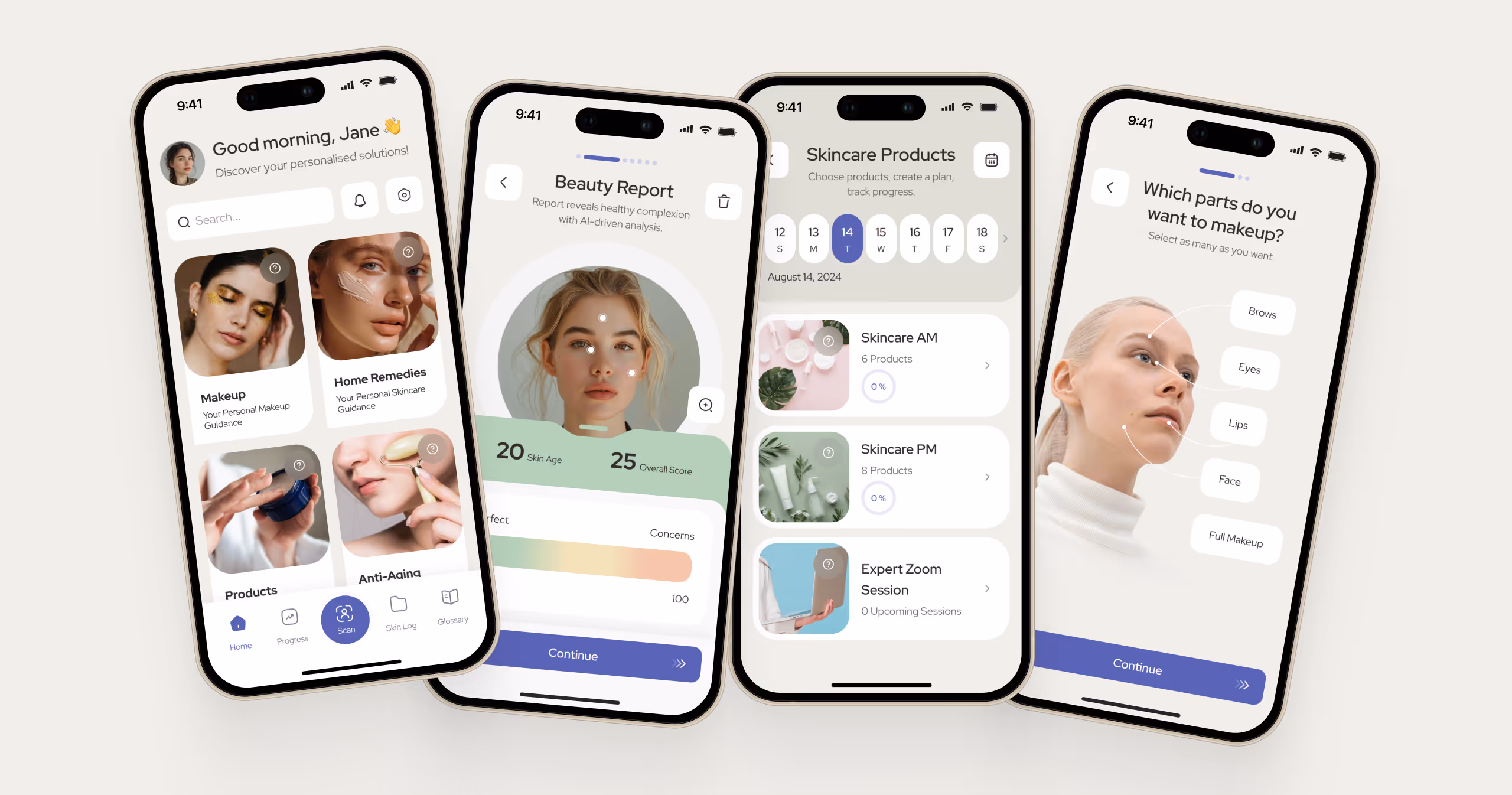
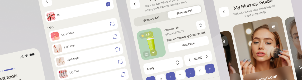
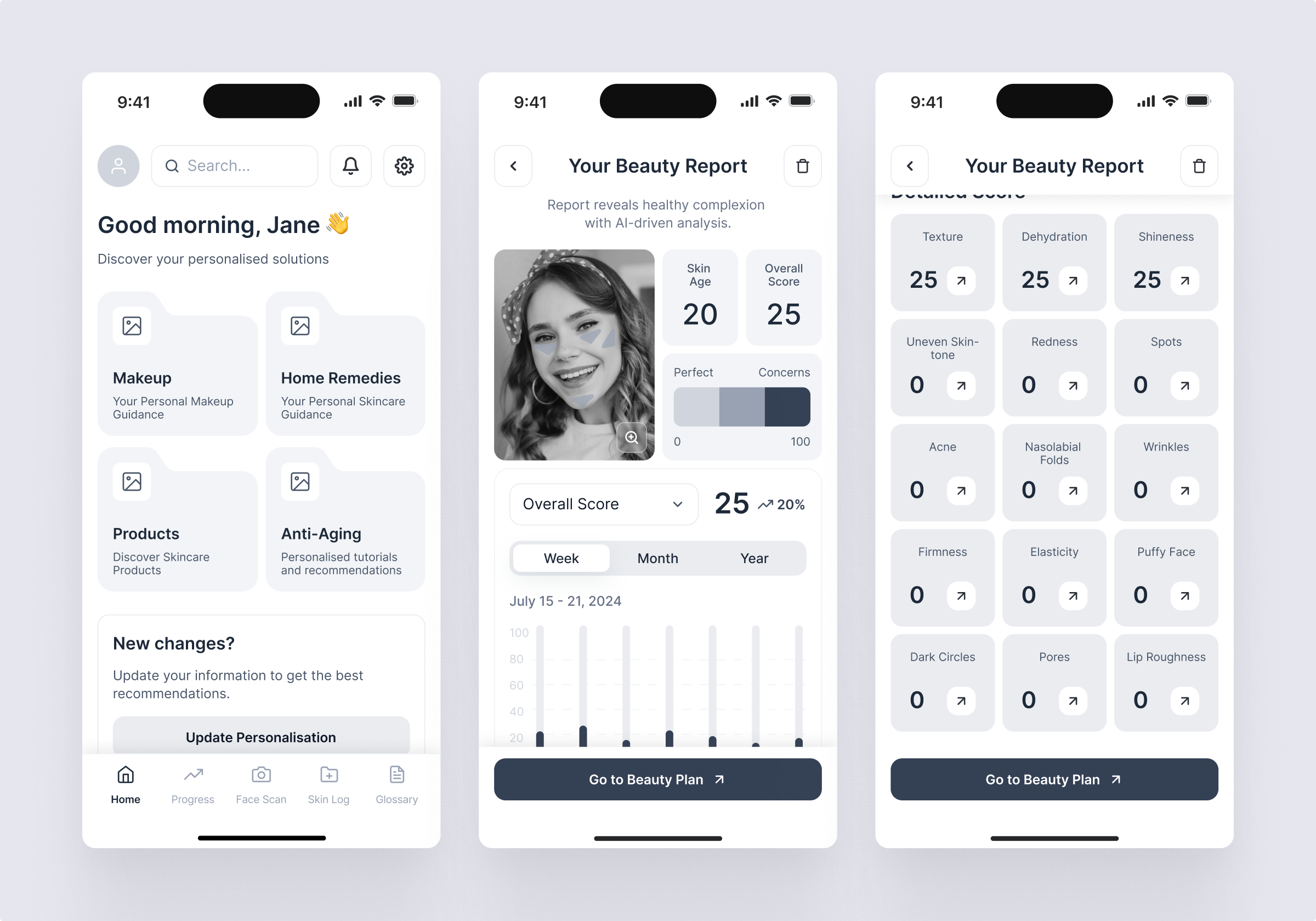
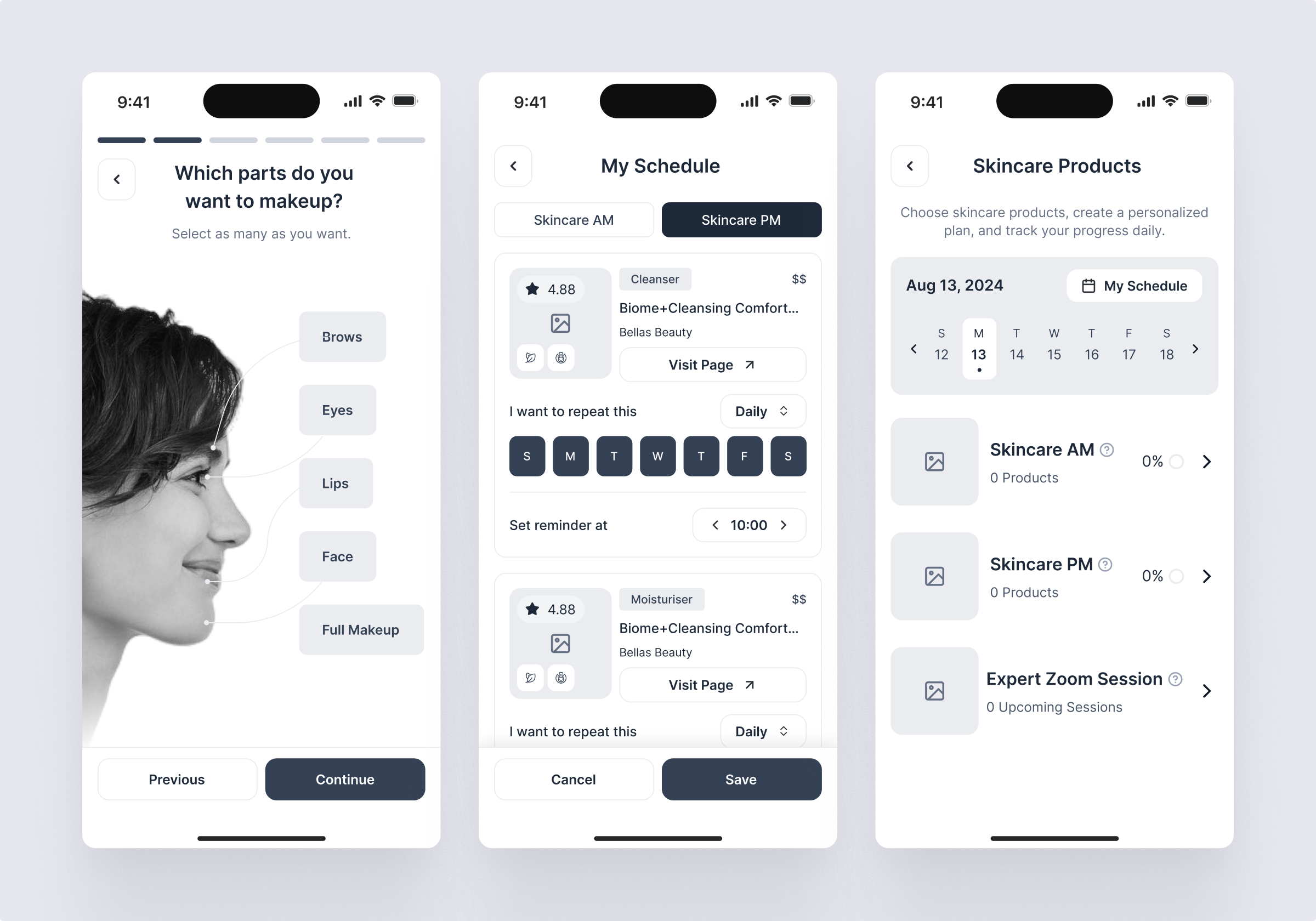
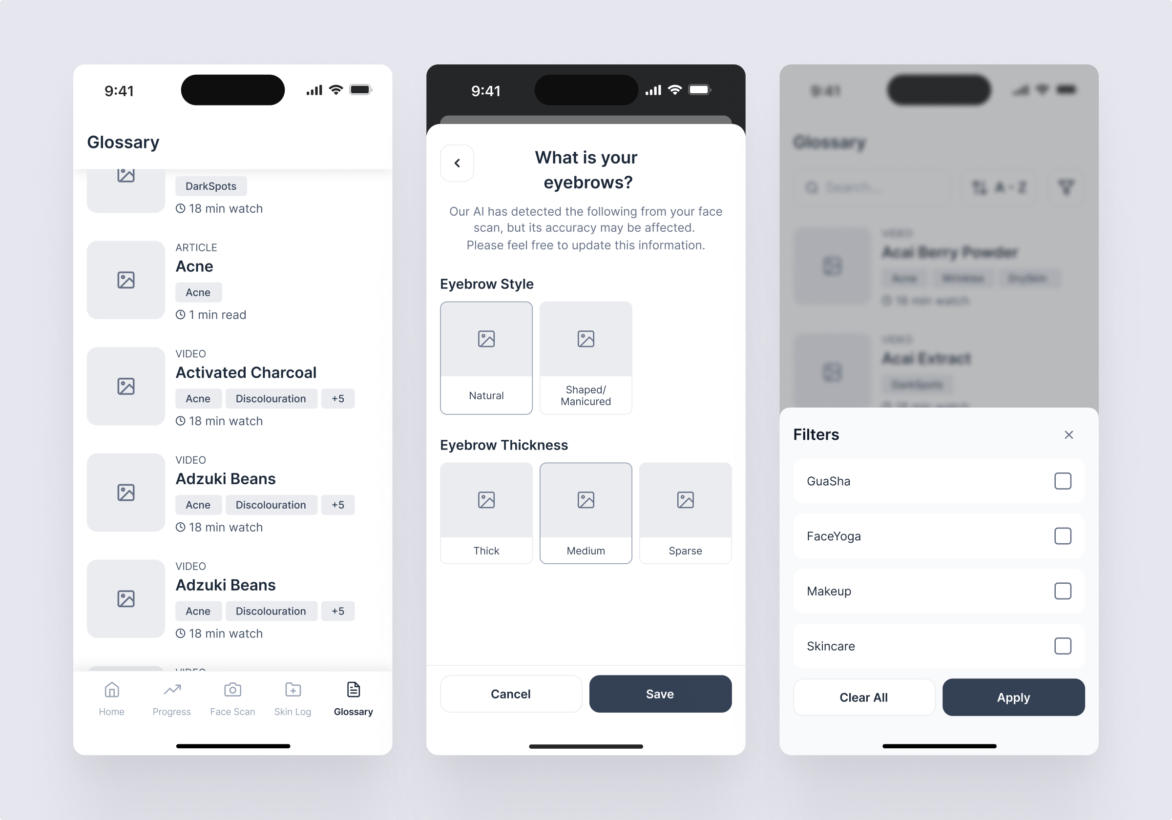
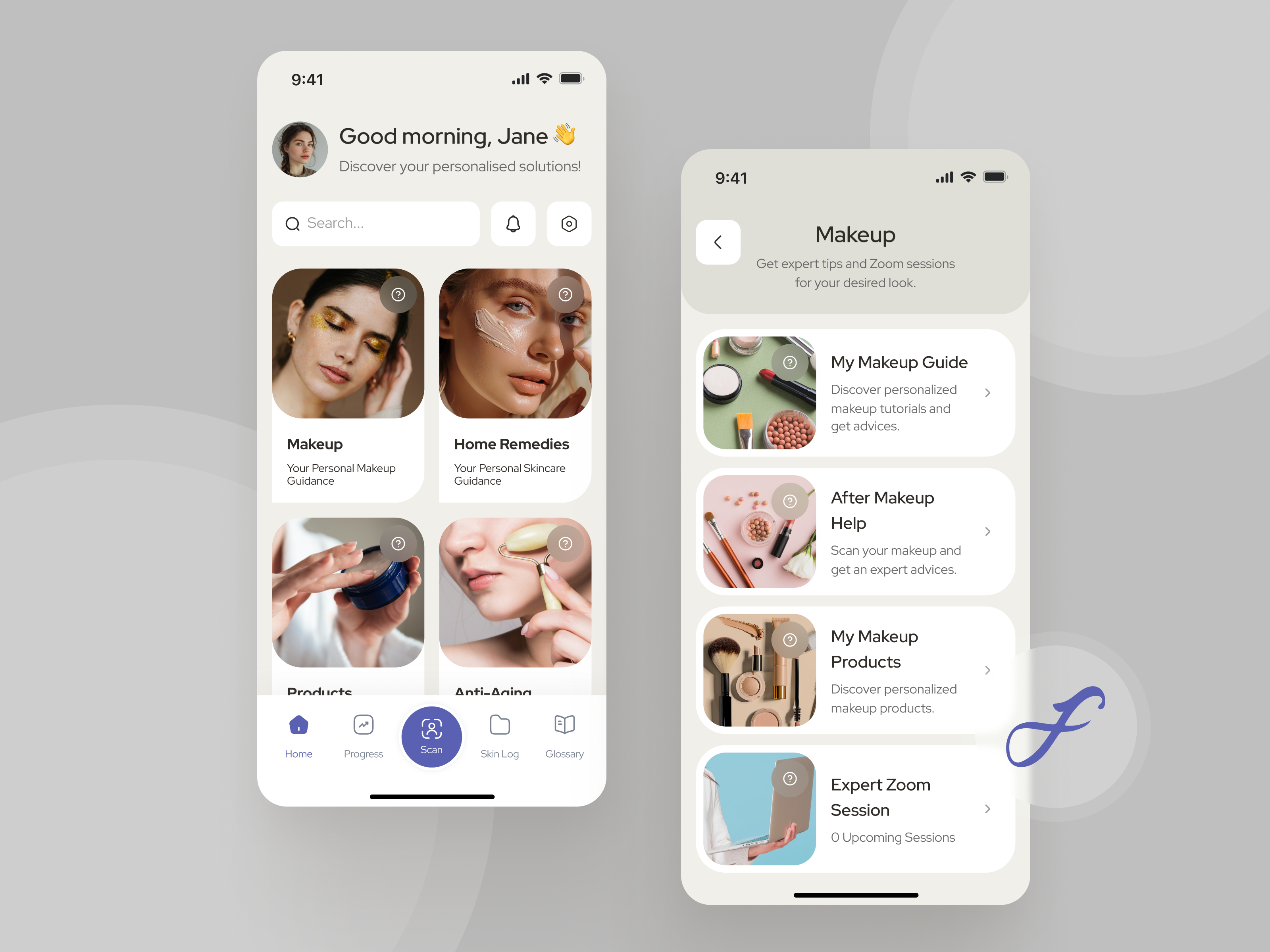
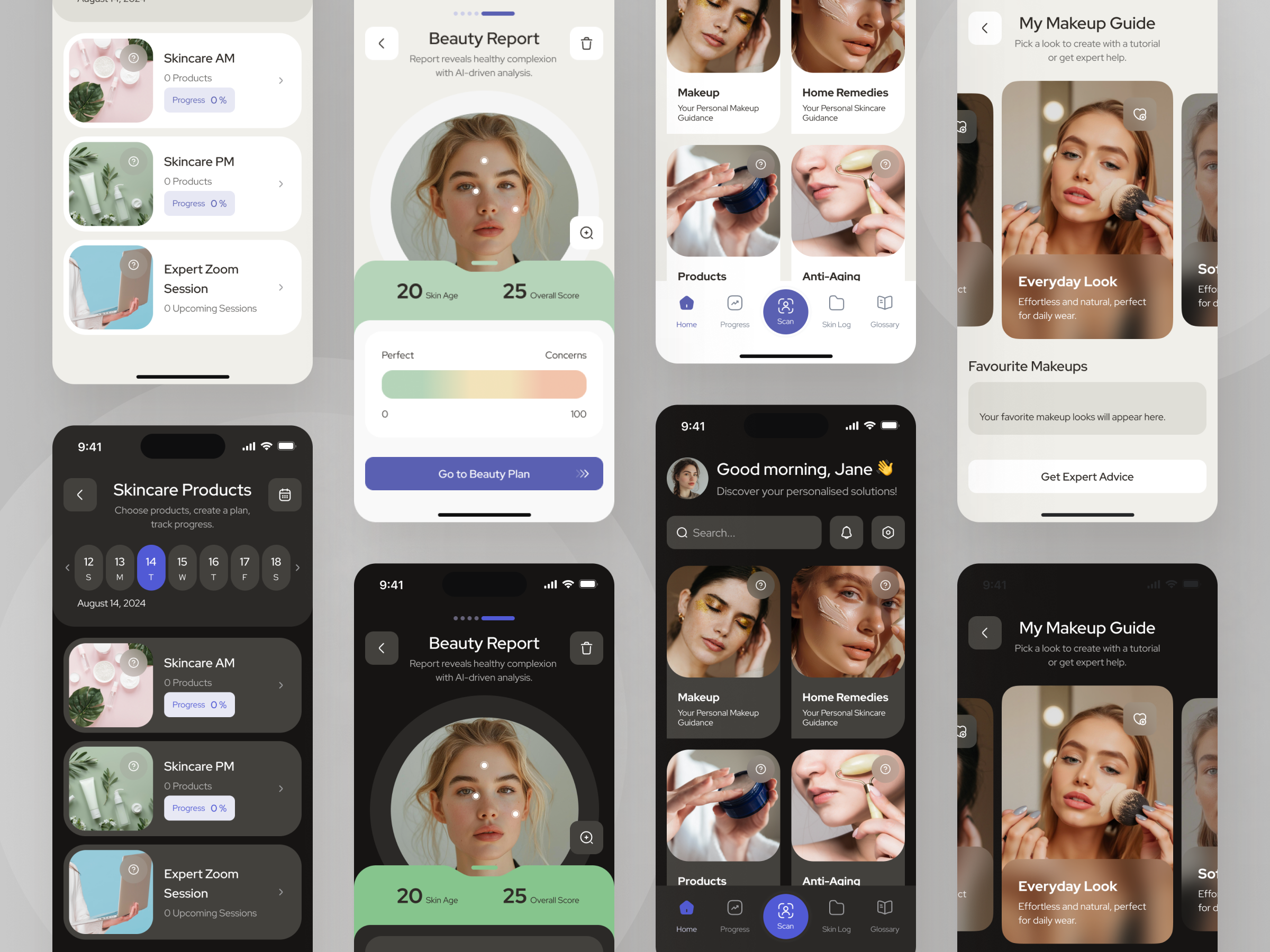
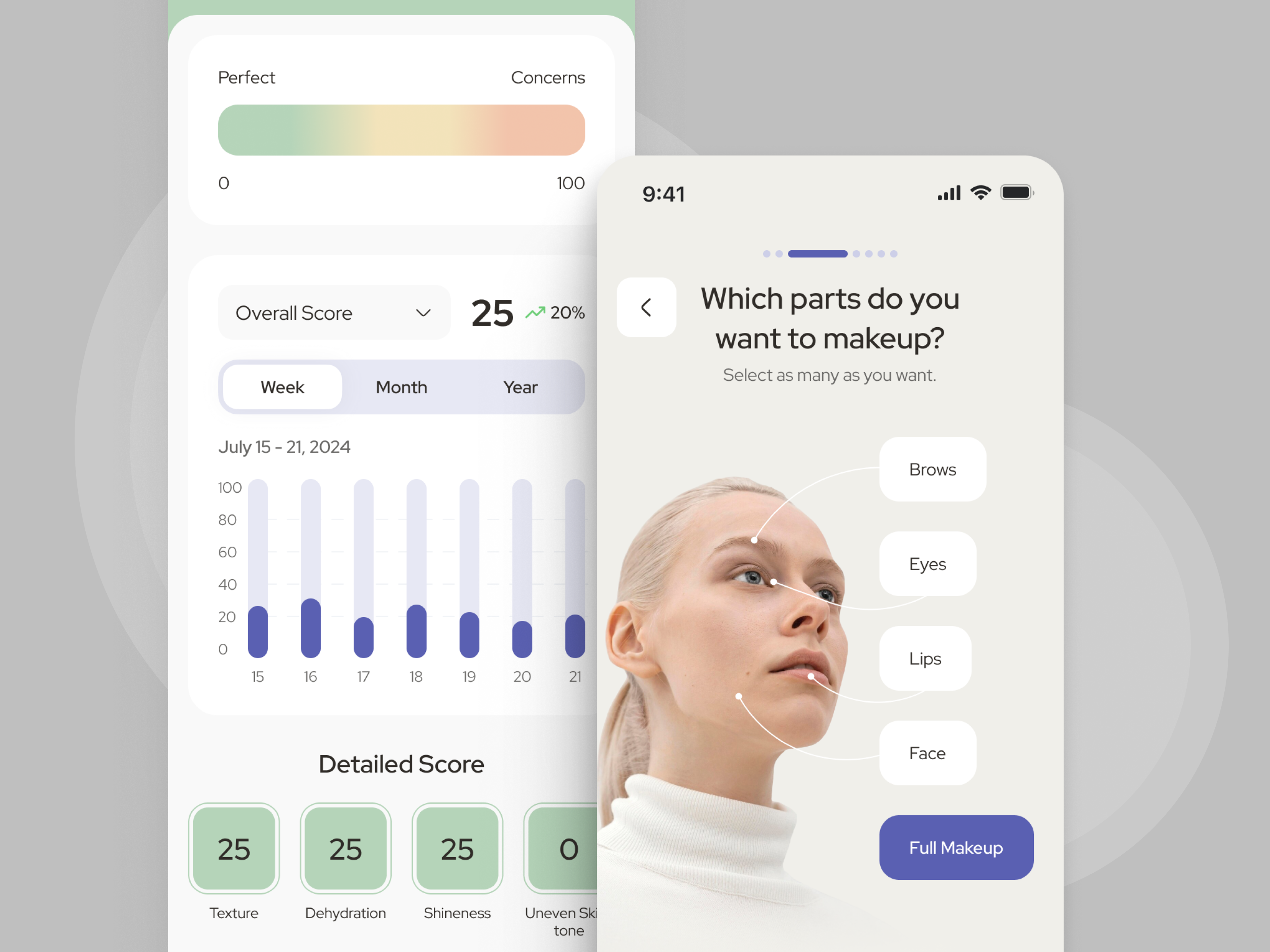
Based on this foundation, we refreshed the app’s visual style and delivered a clean, modern UI that feels intuitive and aligned with the brand.
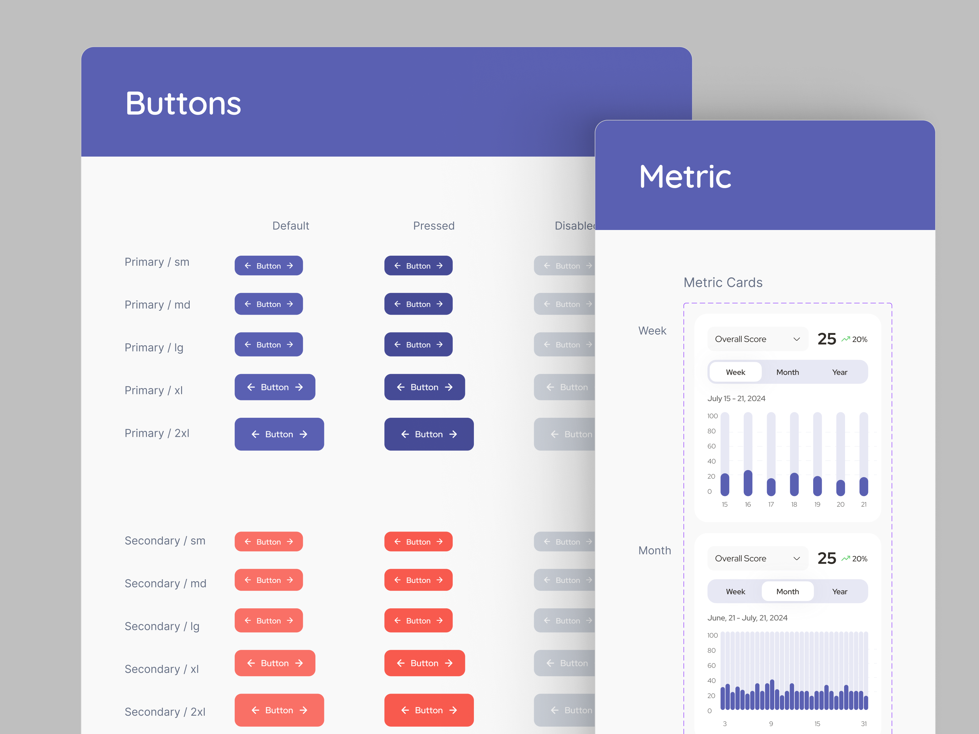
Scope of work


Architecture


Discovery
How we started: Our work began with in-depth research into the beauty tech space, analyzing competitors and user behavior to spot market gaps.
We followed this with a detailed UX audit of the existing design, uncovering usability issues and areas for improvement.
These insights guided targeted UX updates to enhance navigation, AI report clarity, and personalization flow.


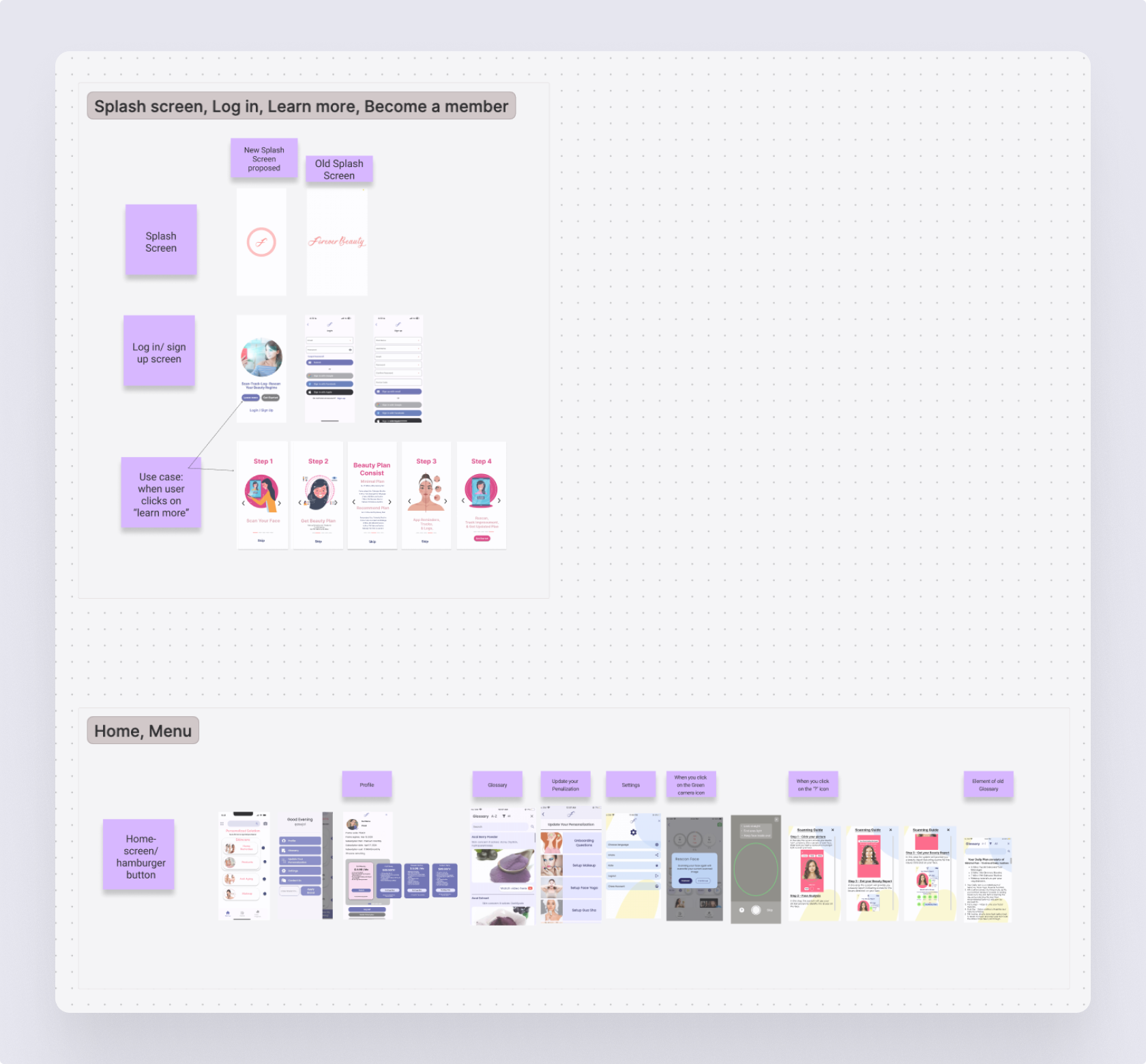
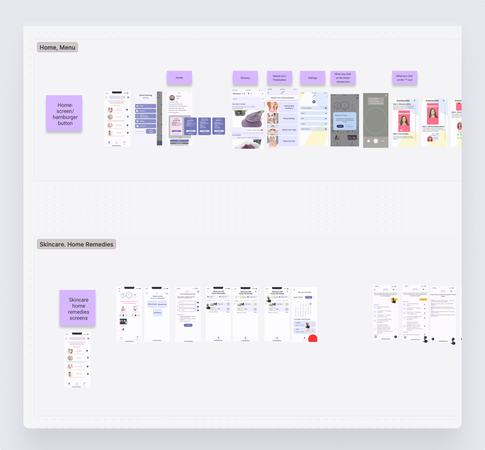
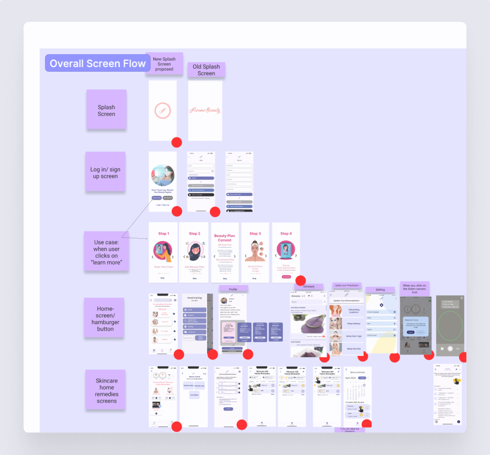
Information Architecture
We used the existing screen layouts as a foundation to map out the application's structure.
Our focus was on reviewing all flows, building clear connections between them, and ensuring nothing was missing — creating a seamless, unified experience across the app.
Discover how thoughtful, user-centered design can transform your product experience and drive real business results. Learn what’s possible when design meets strategy.
Wireframes
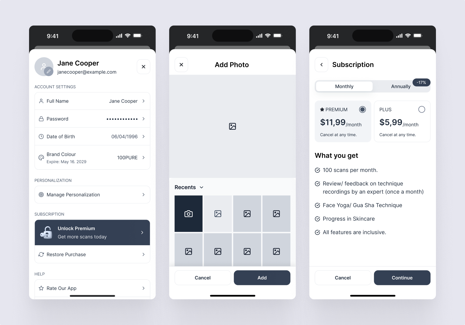
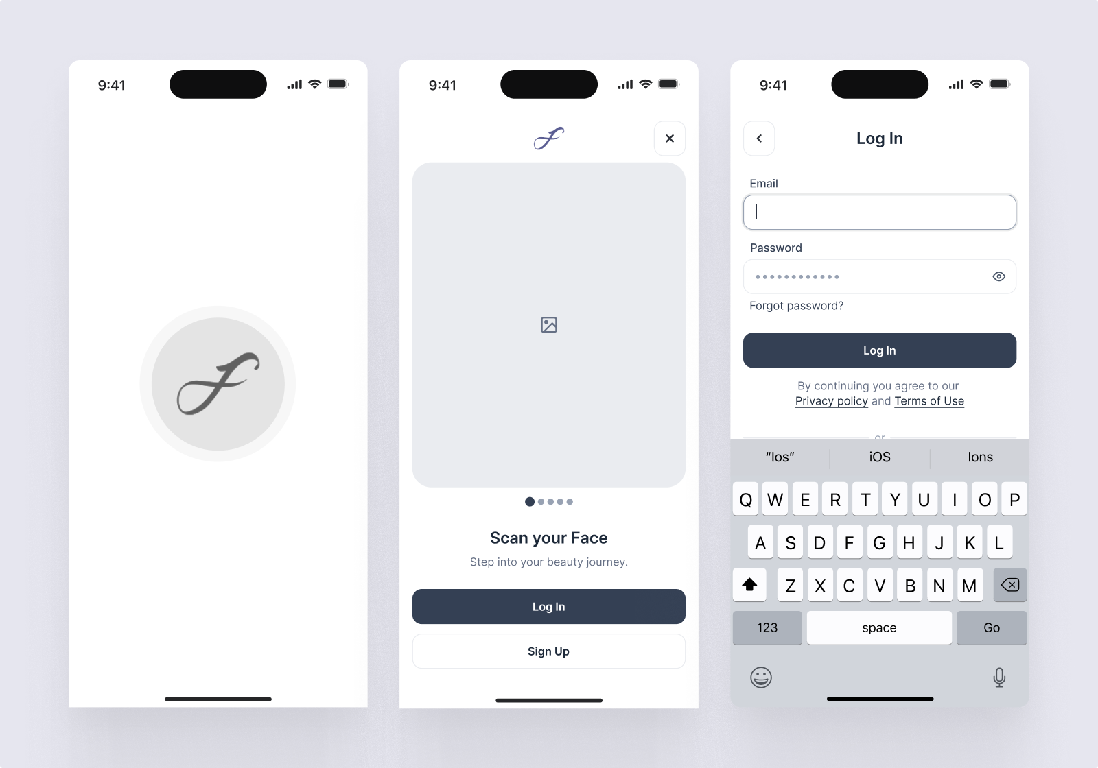
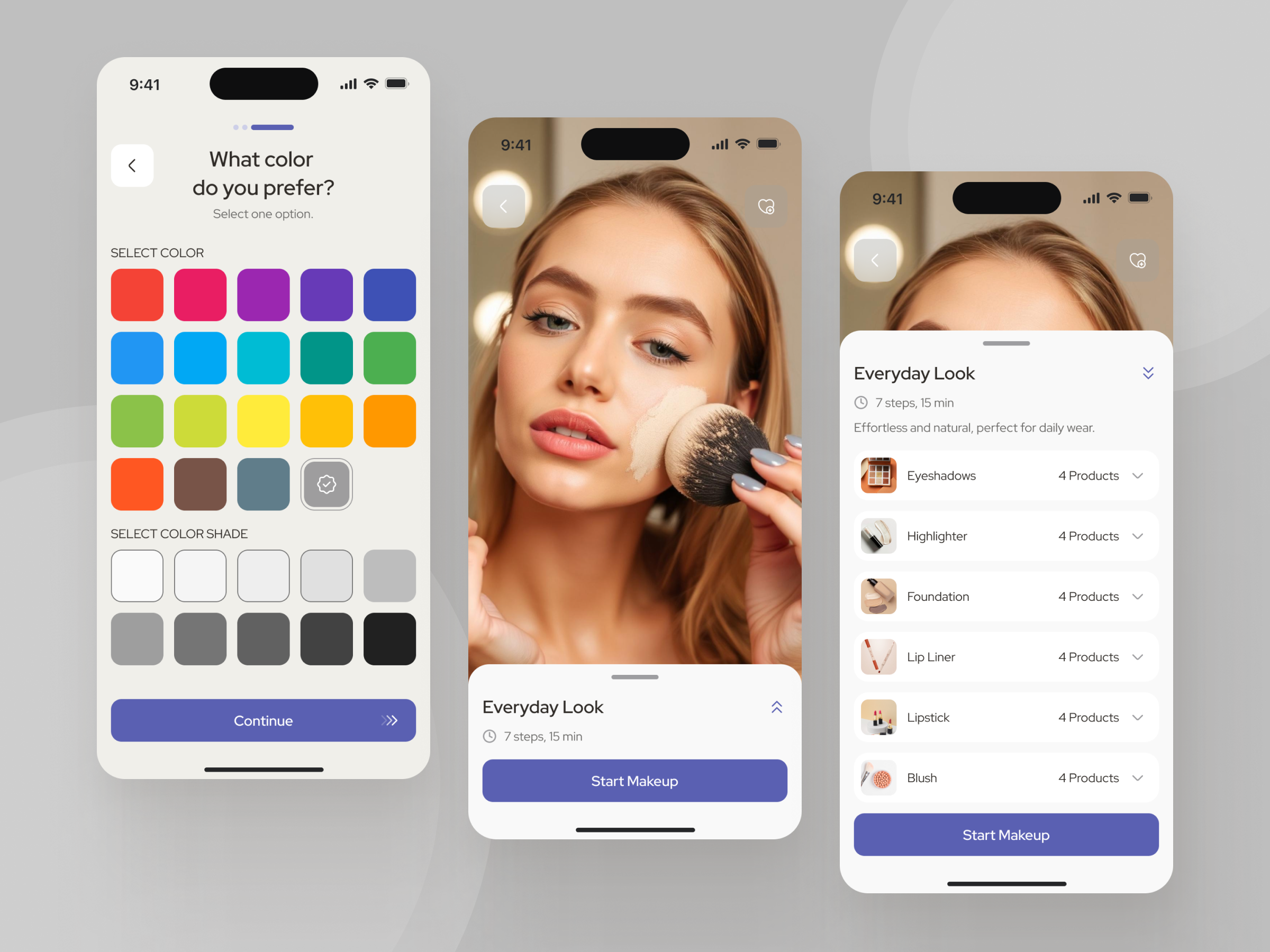
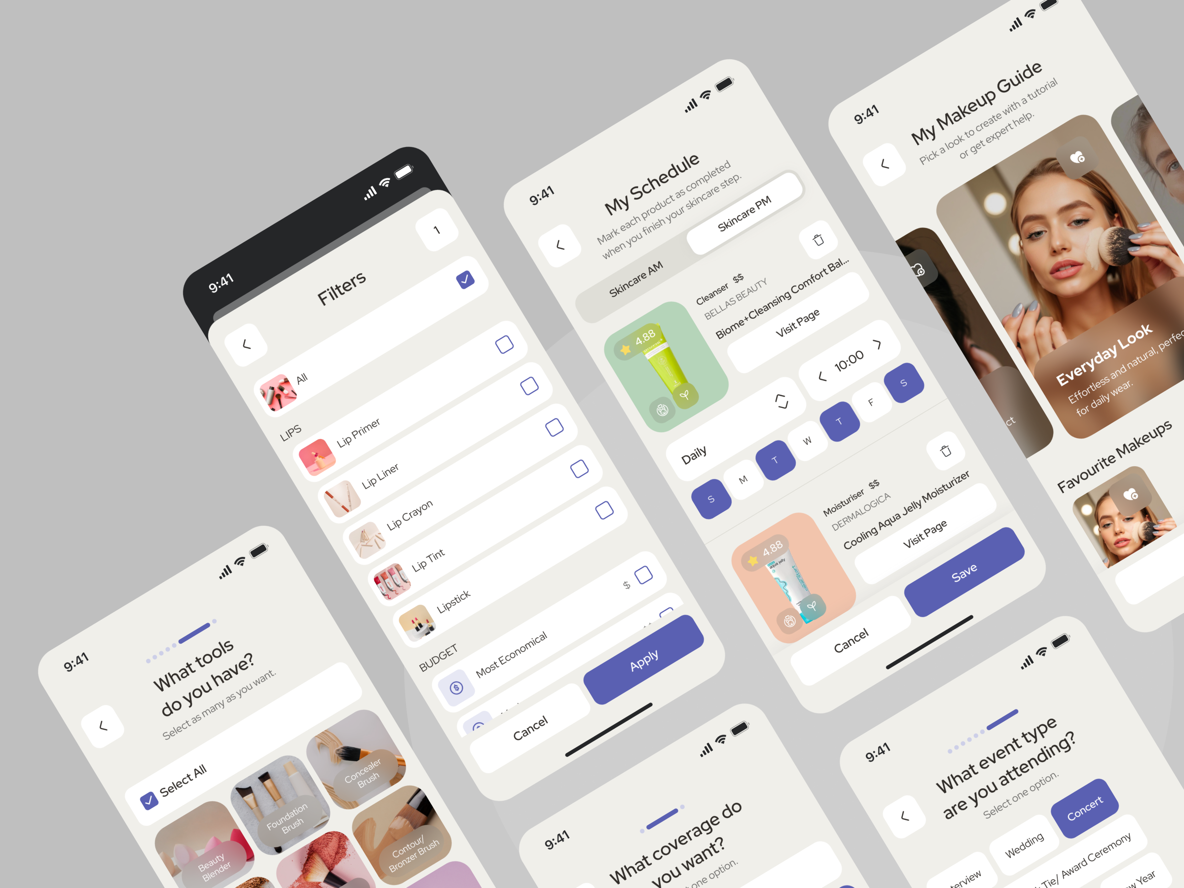
UI prototype
Branding & logo

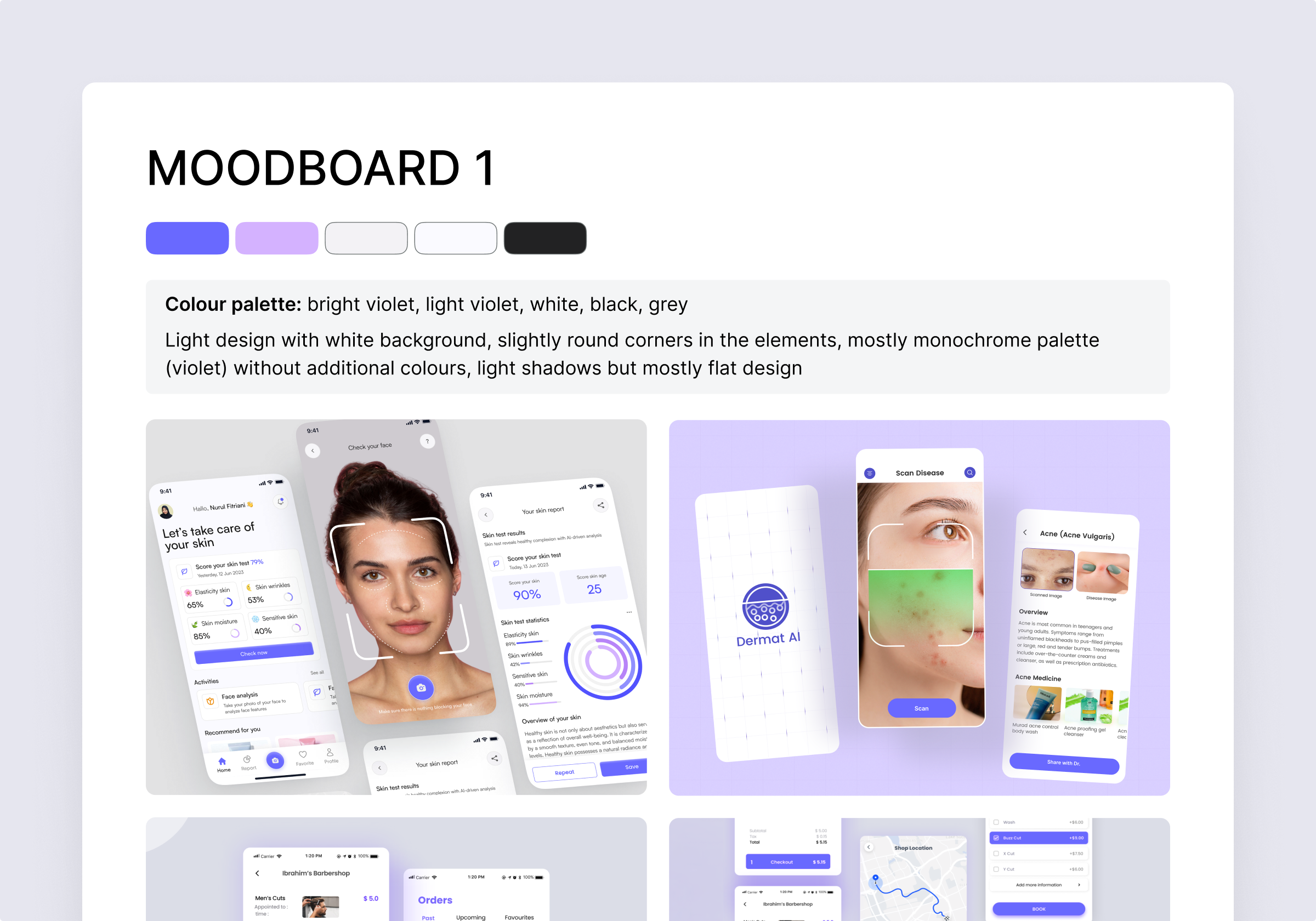
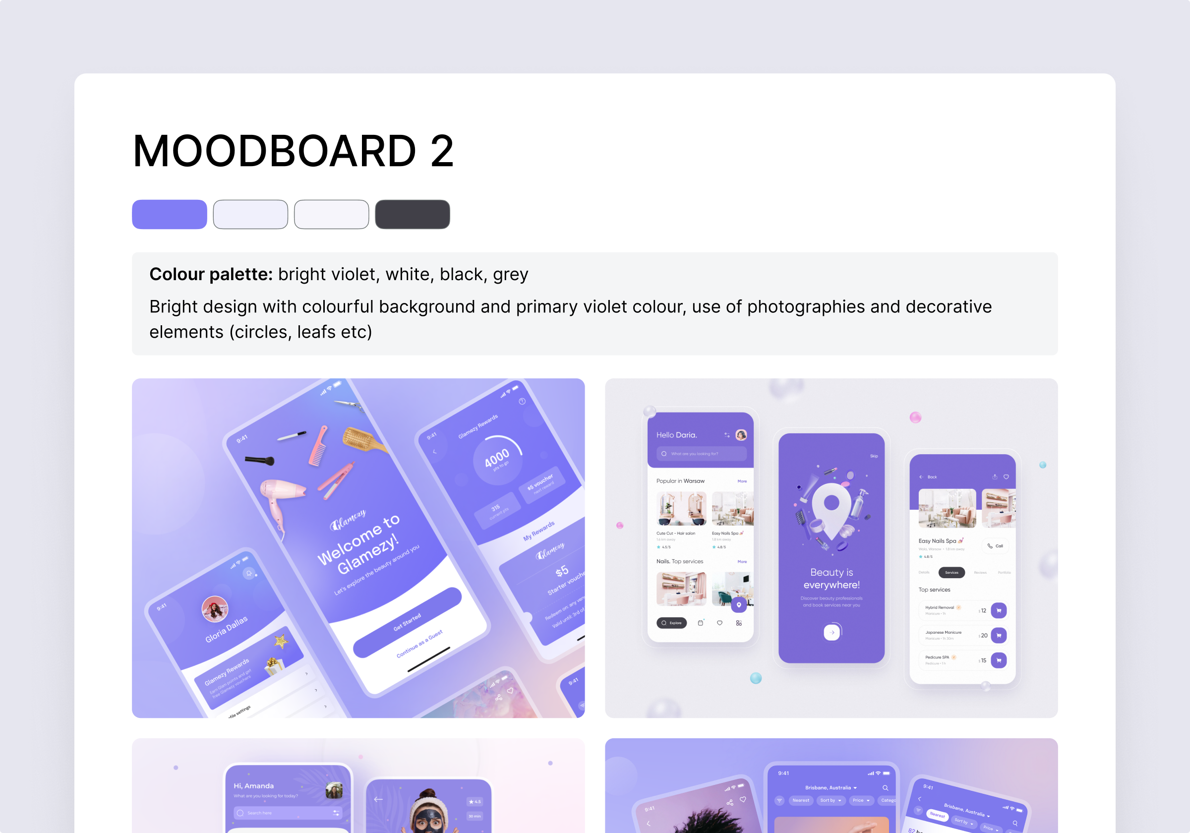
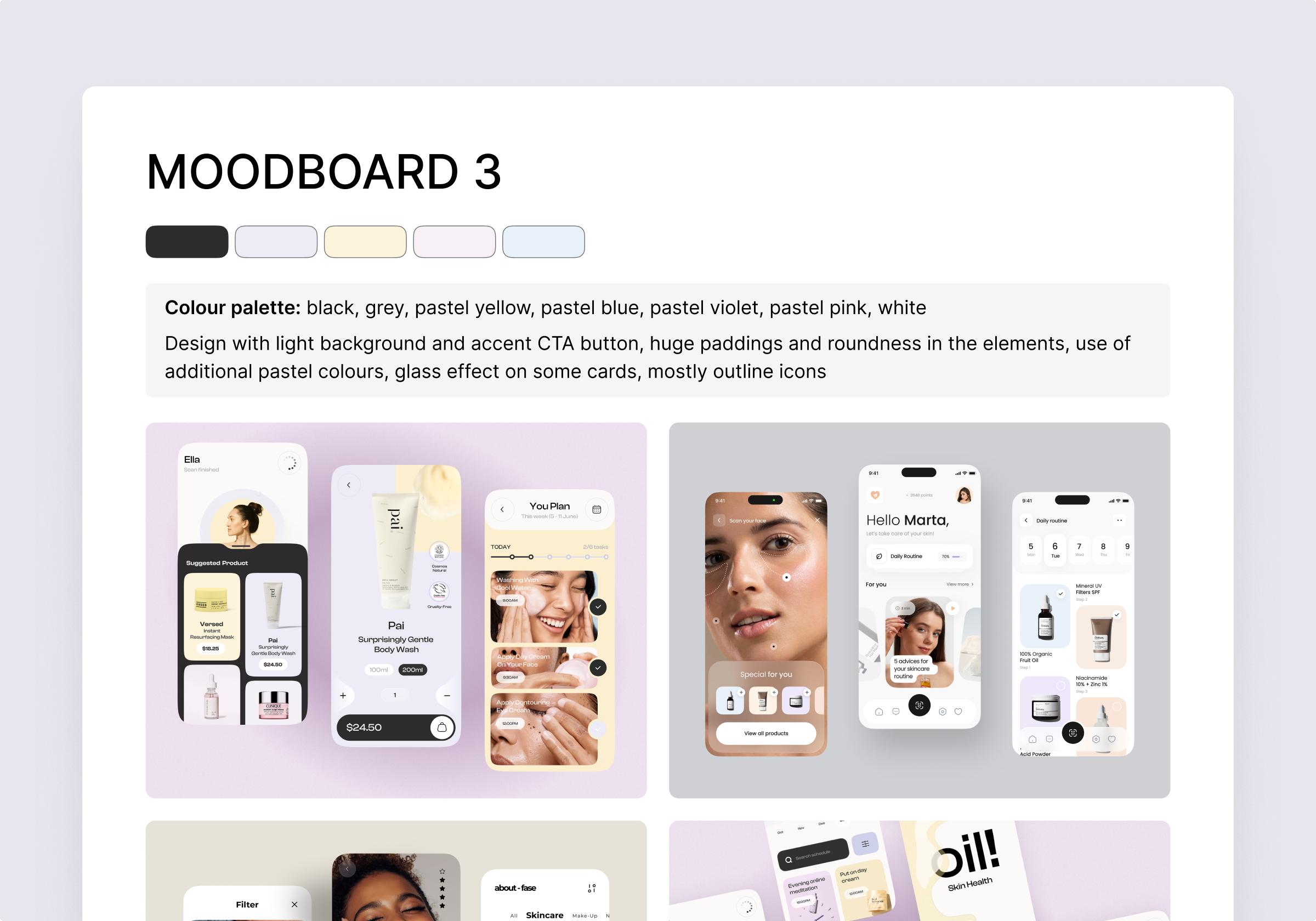
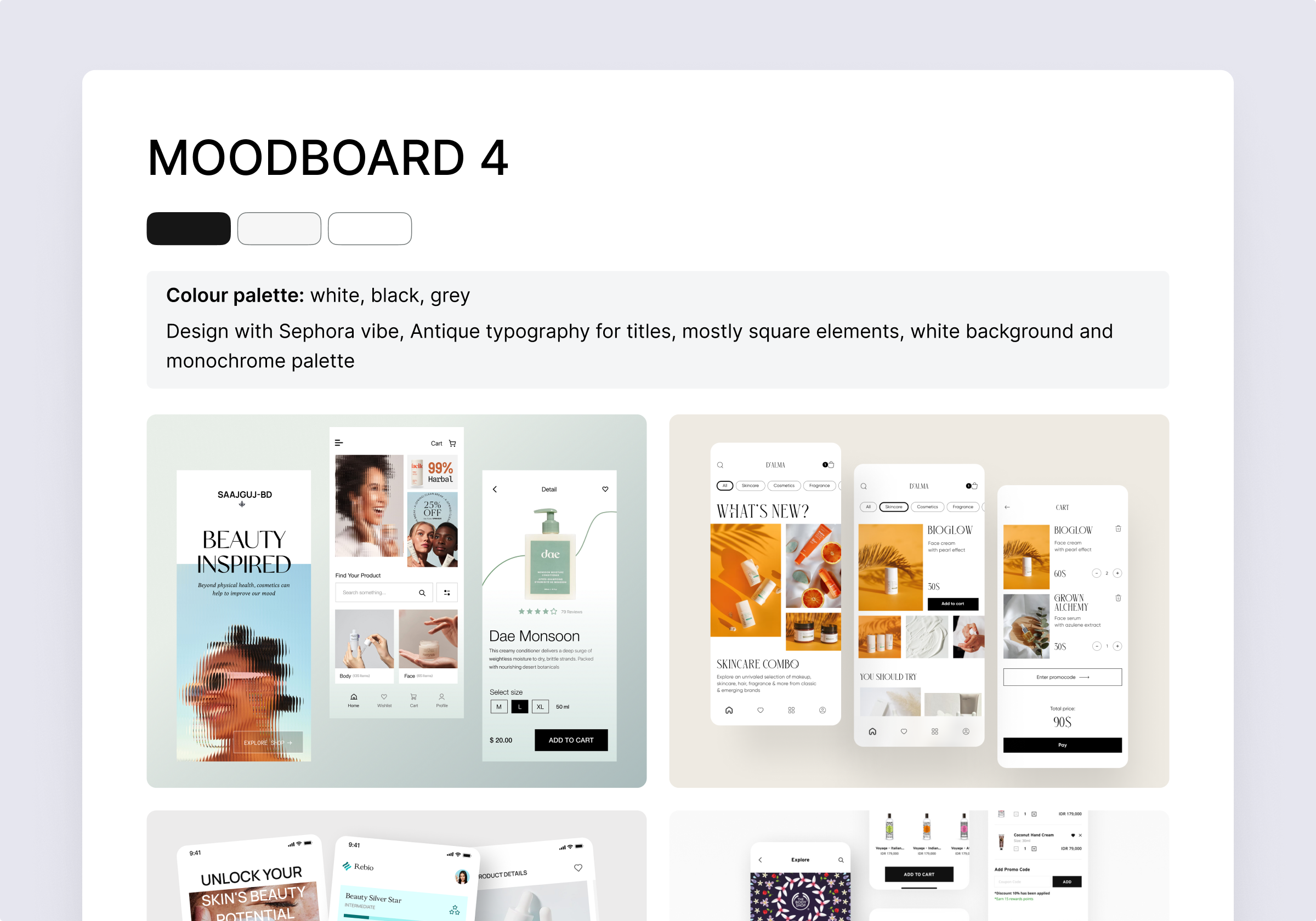
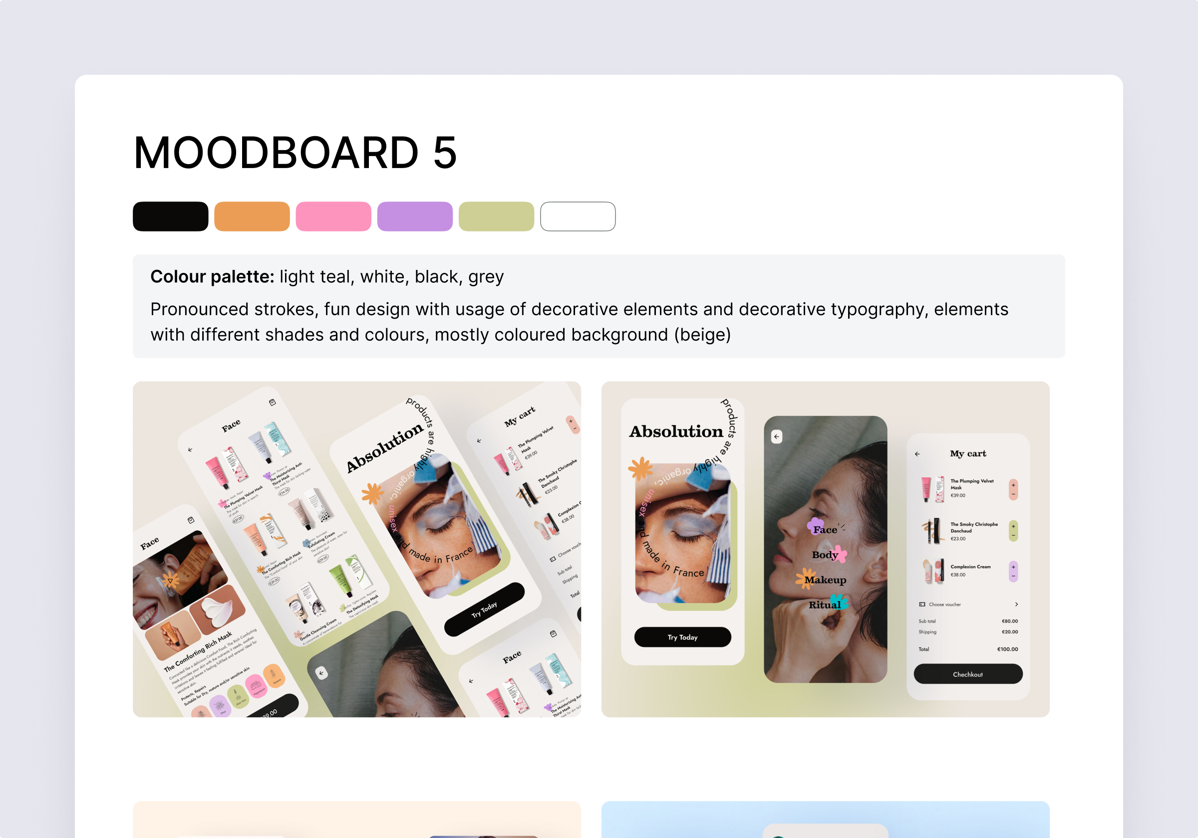
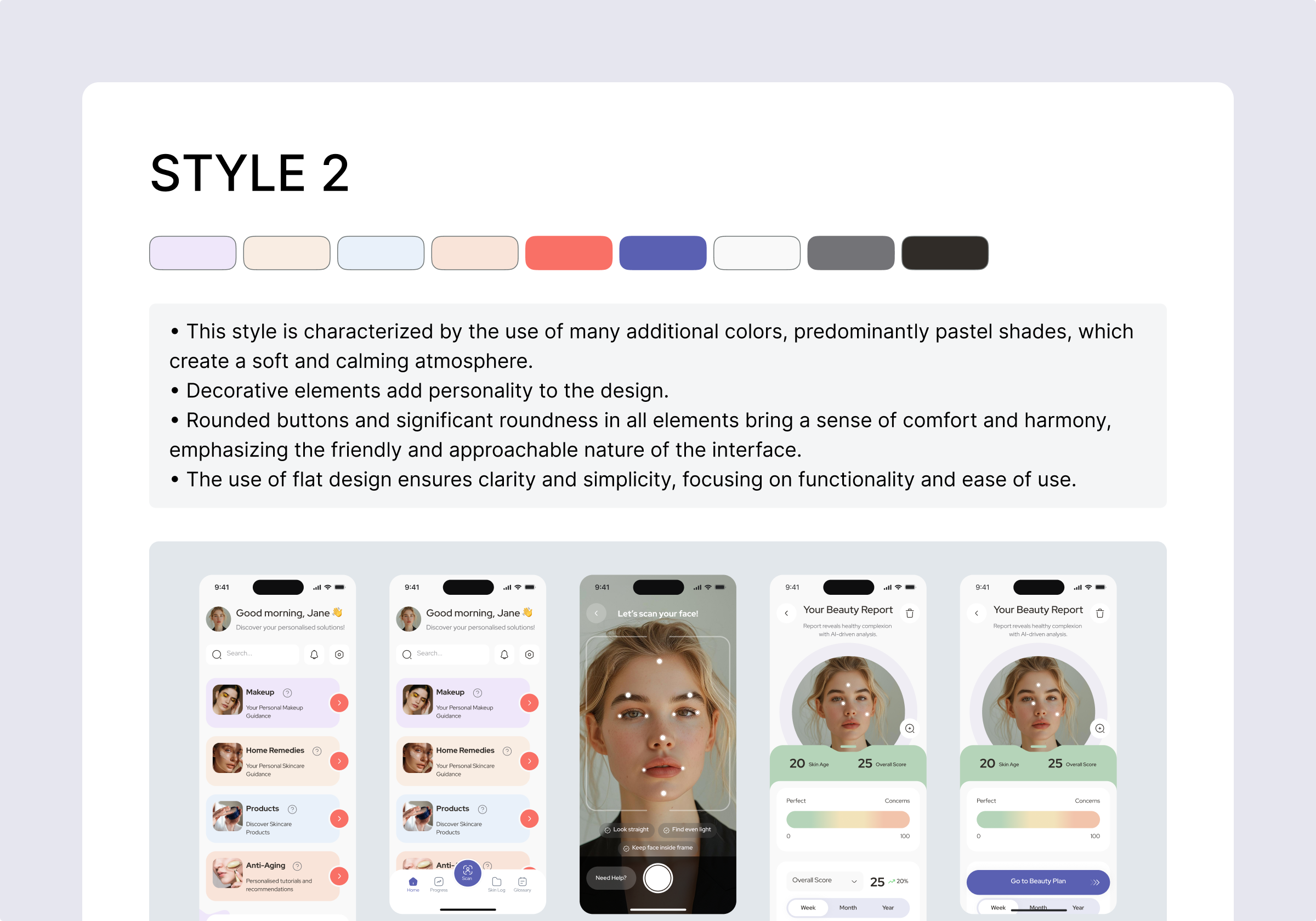
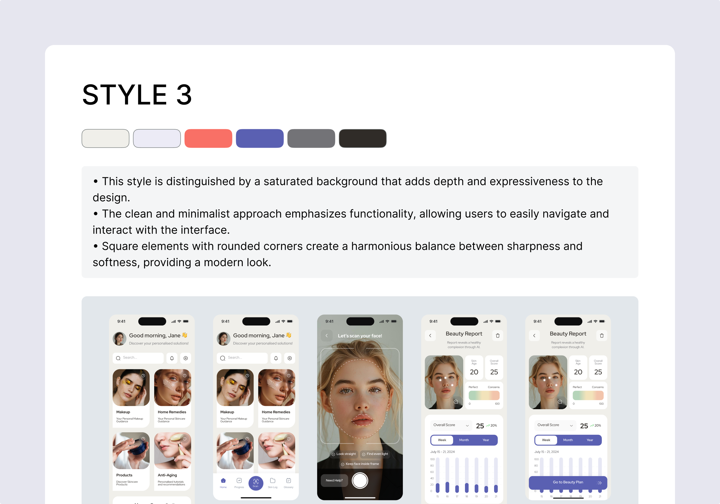
Moodboards + 3 styles

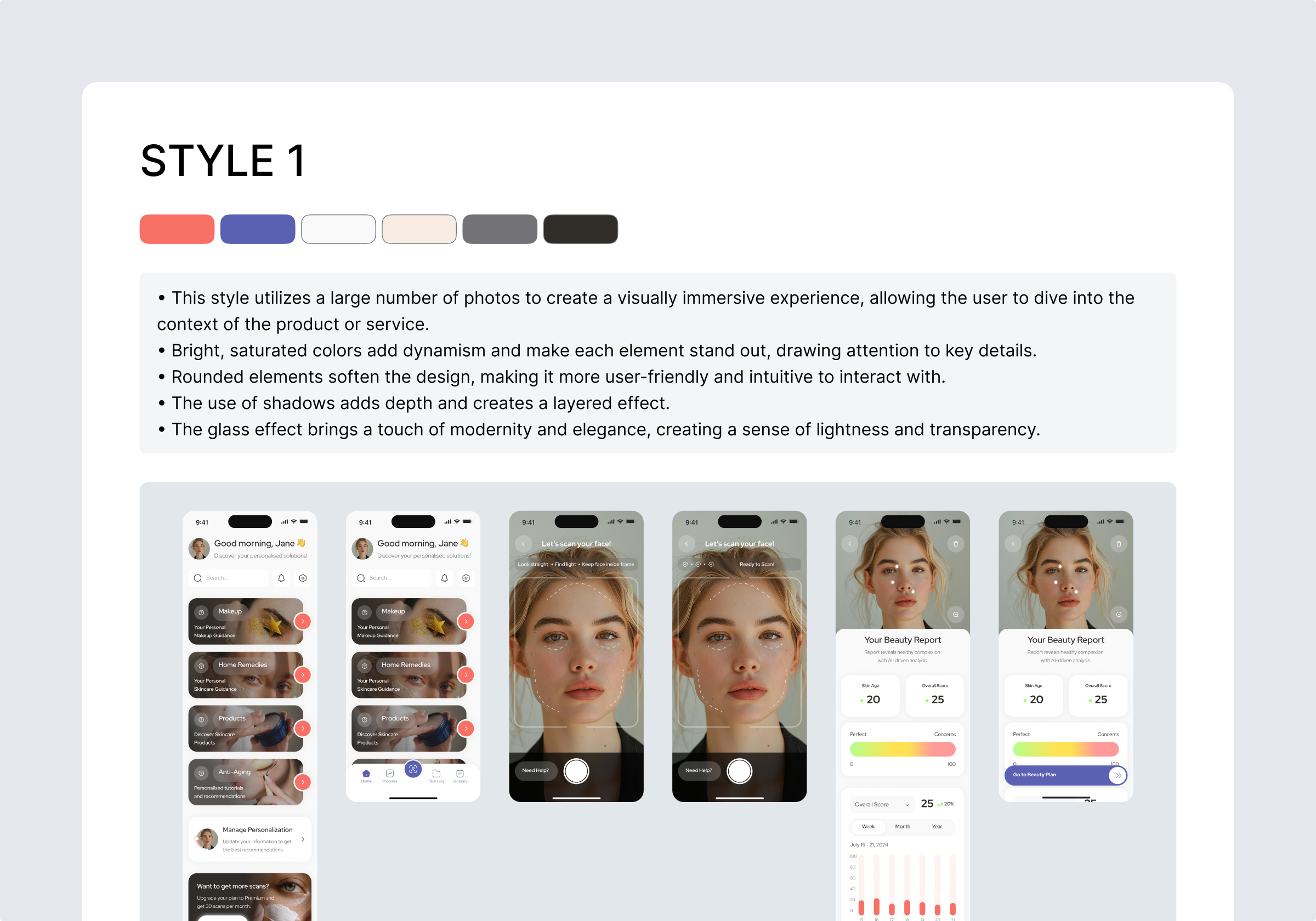
UI & design system stage


Will definitely be hiring again for future work and would highly recommend!

See It in Action: 2 UI Screens Redesigned for Free
Not convinced yet?Get 2 of your screens redesigned for free—and see the difference for yourself.
BOOK A CALLLanding page
Animations

Delivery
Development


.png)


.avif)


.svg)
.svg)
